Introduction
For nearly two decades, responsive web design has depended upon layout techniques that were never originally intended to solve complex application interfaces. Developers have relied on floats, clearfix utilities, nested containers, inline-block elements, absolute positioning, and extensive CSS frameworks to construct multi-column layouts. While these techniques enabled responsive websites, they also introduced unnecessary complexity, difficult maintenance, and markup that often reflected layout requirements rather than document semantics.
The arrival of Flexbox significantly improved one-dimensional layouts by simplifying alignment, spacing, and distribution along a single axis. However, enterprise applications frequently require layouts that organize rows and columns simultaneously. Administrative portals, business dashboards, reporting systems, customer management platforms, and content management applications often demand sophisticated two-dimensional layouts that exceed the design goals of Flexbox.
With CSS Grid now shipping in modern browser implementations, developers finally have a layout system specifically designed to address these requirements using native CSS rather than framework abstractions.
From the perspective of February 2017, CSS Grid represents one of the most significant advancements in front-end architecture since the introduction of responsive web design.
Industry Background
Enterprise web applications continue increasing in complexity.
Organizations commonly develop:
- ◆Business intelligence dashboards.
- ◆Enterprise Resource Planning systems.
- ◆Customer Relationship Management platforms.
- ◆Financial reporting applications.
- ◆Content management systems.
- ◆Analytics portals.
- ◆Software-as-a-Service platforms.
Most existing responsive layouts rely upon:
- ◆Bootstrap grid systems.
- ◆Foundation grids.
- ◆Float-based columns.
- ◆Nested containers.
- ◆Media queries.
- ◆Custom layout utilities.
These approaches have proven successful but often require additional HTML solely for layout purposes.
CSS Grid introduces a native browser solution capable of expressing complex layouts directly within CSS.
The Business Problem
Large front-end applications frequently encounter several layout challenges.
Organizations commonly experience:
- ◆Deep HTML nesting.
- ◆Difficult responsive maintenance.
- ◆Framework dependency.
- ◆Complex float clearing.
- ◆Layout inconsistencies.
- ◆Excessive utility classes.
- ◆Reduced development productivity.
As enterprise interfaces evolve, maintainable layout architecture becomes increasingly important for long-term software quality.
Understanding the Technology
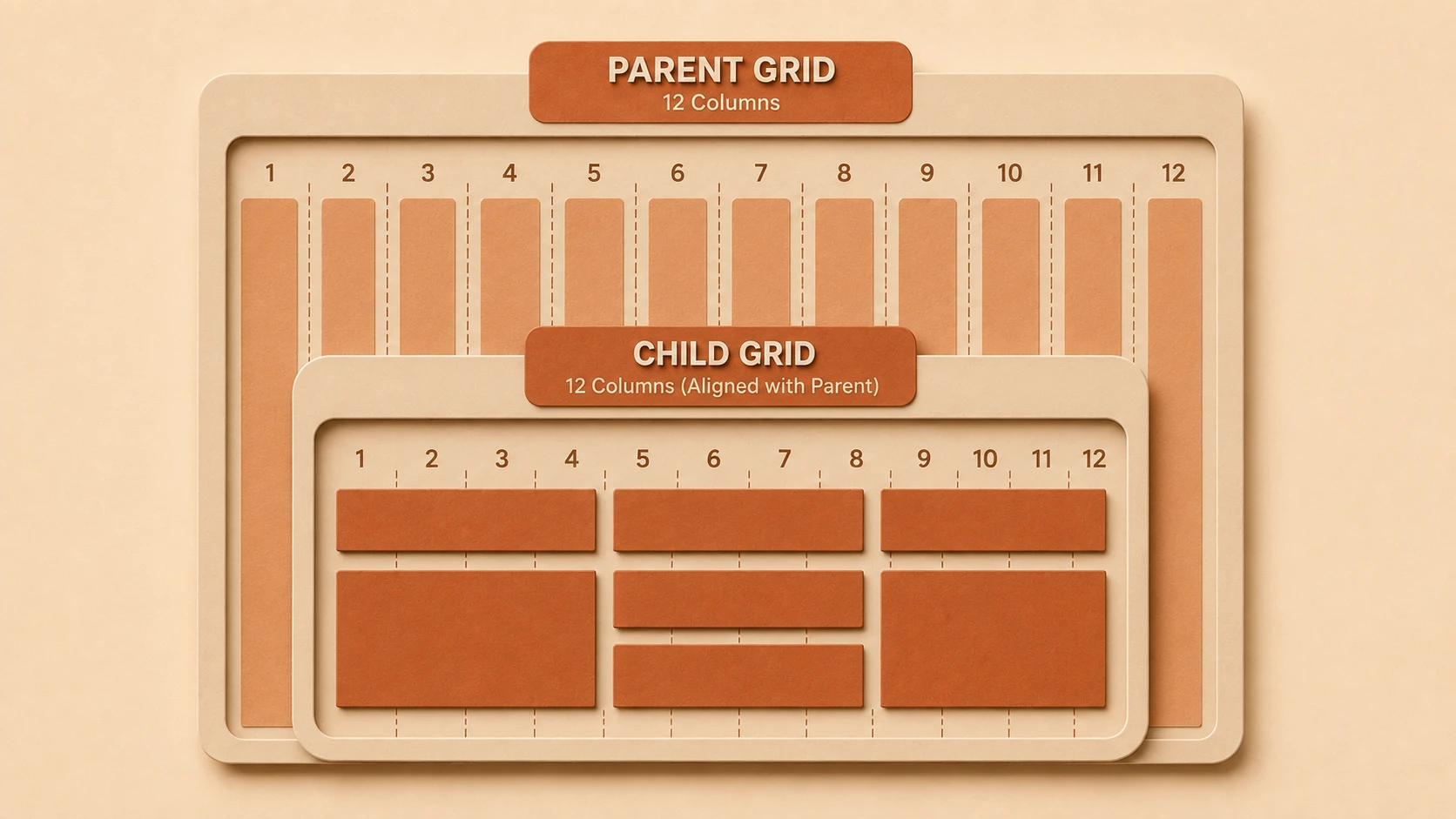
CSS Grid is a two-dimensional layout specification allowing developers to define both rows and columns within a single layout model.
Major concepts include:
- ◆Grid containers.
- ◆Grid items.
- ◆Grid tracks.
- ◆Grid lines.
- ◆Grid areas.
- ◆Explicit grids.
- ◆Implicit grids.
- ◆Fractional units.
Unlike earlier layout techniques, Grid separates content structure from page layout while allowing browsers to calculate positioning using a standardized algorithm.
Core Architecture
A simplified Grid architecture appears below.
| Component | Responsibility |
|---|---|
| HTML Document | Semantic content |
| CSS Grid Container | Defines layout context |
| Grid Tracks | Rows and columns |
| Grid Items | Interface components |
| Media Queries | Responsive adaptations |
| Browser Layout Engine | Computes final positioning |
This architecture reduces dependence on nested containers while improving layout clarity.
Key Features
Native Two-Dimensional Layout
Grid manages rows and columns simultaneously.
Developers can position interface elements without relying on floats or excessive nesting.
This greatly simplifies dashboard and portal development.
Fractional Units
The new fractional (fr) unit allows available space to be distributed proportionally across columns and rows.
This provides a more intuitive approach than percentage-based calculations.
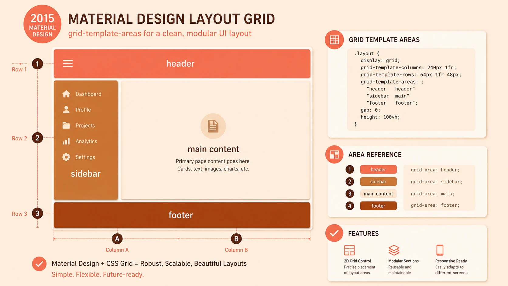
Grid Areas
Developers can define named layout regions representing headers, navigation, sidebars, content sections, or footers.
Named areas improve stylesheet readability and simplify layout maintenance.
Explicit Placement
Elements may be assigned to precise grid locations independent of document flow where appropriate.
This enables sophisticated responsive layouts using relatively little CSS.
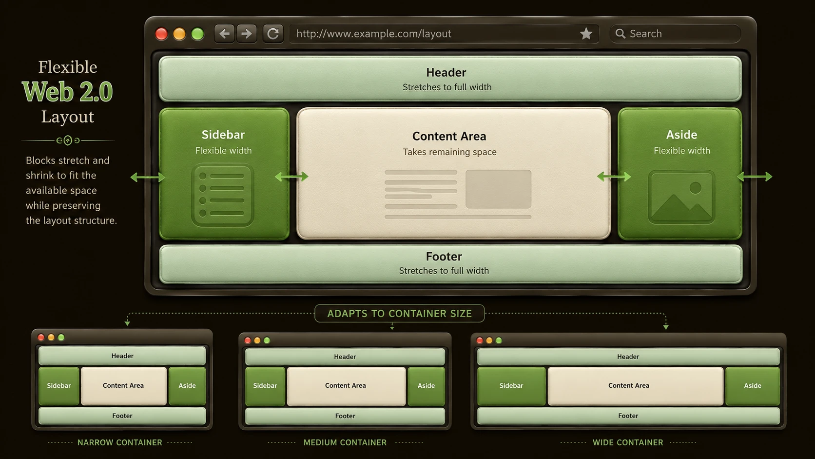
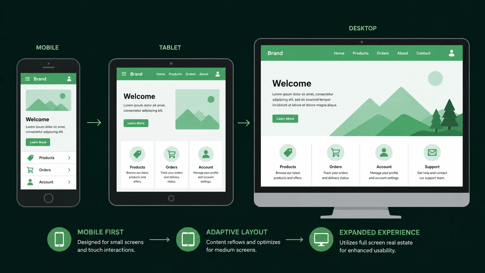
Responsive Layout Support
Grid integrates naturally with media queries, allowing layouts to adapt across desktop, tablet, and mobile devices.
Rather than redesigning entire page structures, developers can redefine grid arrangements for different viewport sizes.
Reduced Framework Dependence
Many traditional CSS framework grid utilities become less necessary because browsers now provide equivalent layout capabilities natively.
How It Works
A simplified rendering workflow appears below.
HTML Structure
       |
CSS Grid Definitions
       |
Grid Tracks Calculated
       |
Grid Items Positioned
       |
Responsive Adjustments
       |
Rendered Interface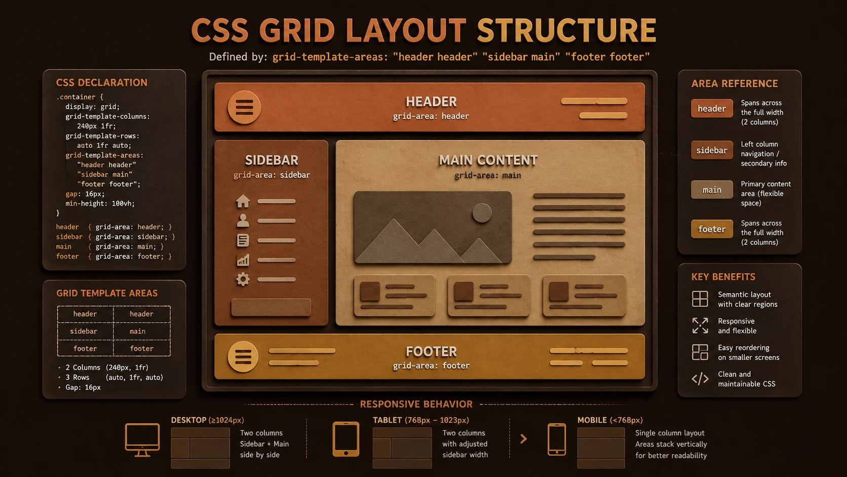
System architecture diagram and conceptual workflow layout for CSS Grid Shipped.
The browser computes layout directly from Grid definitions instead of relying on float calculations or JavaScript positioning.
Enterprise Use Cases
Business Dashboards
Analytics interfaces containing charts, reports, navigation panels, and filters benefit from Grid's structured two-dimensional layout.
Administrative Portals
Enterprise management systems often require multiple independently positioned interface regions that map naturally to Grid.
Content Management Systems
Editorial workflows involving navigation, editing panels, previews, and metadata can be organized more cleanly.
Financial Applications
Complex reporting interfaces benefit from precise alignment across multiple interface regions.
Software-as-a-Service Platforms
Large customer-facing applications can simplify layout architecture while improving long-term maintainability.
Performance Considerations
CSS Grid primarily affects browser layout calculations rather than application execution.
Organizations should evaluate:
- ◆Rendering performance.
- ◆DOM complexity.
- ◆Stylesheet maintainability.
- ◆Responsive layout efficiency.
- ◆Browser compatibility.
- ◆Framework overhead reduction.
Reducing unnecessary wrapper elements may simplify rendering and improve long-term maintenance.
Security Considerations
Grid affects presentation rather than application security.
Organizations should continue implementing:
- ◆HTTPS.
- ◆Authentication.
- ◆Authorization.
- ◆Input validation.
- ◆Content Security Policy.
- ◆Secure API communication.
Modern layout capabilities complement but do not replace secure application architecture.
Scalability
Grid encourages scalable front-end engineering.
Advantages include:
- ◆Cleaner CSS.
- ◆Reduced layout duplication.
- ◆Improved responsive maintenance.
- ◆Better collaboration between design and engineering teams.
- ◆Simplified interface evolution.
These characteristics become increasingly valuable as enterprise applications continue expanding.
Best Practices
Organizations adopting CSS Grid should:
- ◆Preserve semantic HTML.
- ◆Use Grid for page-level and two-dimensional layouts.
- ◆Continue using Flexbox for one-dimensional alignment.
- ◆Minimize unnecessary nested containers.
- ◆Test layouts across supported browsers.
- ◆Build reusable Grid layout patterns.
- ◆Validate responsive behavior throughout development.
Grid should complement established responsive design practices rather than replace them entirely.
Common Mistakes
| Mistake | Business Impact |
|---|---|
| Assuming Grid replaces Flexbox completely | Poor architectural decisions |
| Rebuilding existing stable layouts unnecessarily | Increased migration cost |
| Ignoring browser compatibility requirements | Deployment issues |
| Mixing multiple layout strategies without planning | Reduced maintainability |
| Excessive explicit positioning | Lower layout flexibility |
| Neglecting responsive testing | Inconsistent user experience |
Organizations should adopt Grid where its strengths align with application requirements.
Technology Comparison
| Technology | Primary Purpose | Best Use Case |
|---|---|---|
| Floats | Legacy layout technique | Simple legacy layouts and text wrapping |
| Flexbox | One-dimensional layout | Navigation bars, toolbars, form alignment, flexible rows or columns |
| CSS Grid | Two-dimensional layout | Complete application layouts, dashboards, portals, responsive page structure |
Grid complements Flexbox rather than replacing it. Together they provide a comprehensive native layout toolkit for modern web applications.
Adoption Strategy
Organizations should adopt CSS Grid through incremental modernization.
- 1.Evaluate browser support within target environments.
- 2.Prototype new application layouts using Grid.
- 3.Continue using Flexbox where appropriate.
- 4.Reduce dependence on framework-specific grid systems for new projects.
- 5.Develop reusable internal layout standards.
- 6.Introduce Grid into production following comprehensive compatibility testing.
This measured approach balances innovation with enterprise stability.
Limitations
As of February 2017, CSS Grid has recently become available in modern browser implementations.
Organizations should recognize several considerations.
- ◆Browser compatibility should be validated against enterprise requirements.
- ◆Existing framework-based layouts remain suitable for many production systems.
- ◆Development teams require experience with new layout concepts.
- ◆Legacy browser support may influence deployment strategies.
- ◆Responsive testing remains essential.
These considerations should guide enterprise adoption planning.
Looking Ahead
From the perspective of February 2017, CSS Grid marks the beginning of a new era in responsive web design. By providing a native two-dimensional layout system, the CSS Working Group and browser vendors have addressed a long-standing limitation of web development that previously required extensive framework abstractions and layout workarounds.
Rather than replacing Flexbox, CSS Grid complements it by solving a different class of layout problems. Organizations building modern enterprise applications should begin evaluating Grid for new development projects, particularly where complex responsive interfaces, long-term maintainability, and reduced framework dependency are important architectural objectives.