Introduction
For more than a decade, front-end developers have relied on CSS techniques that were never originally intended for building sophisticated application layouts. Floats, inline-block elements, absolute positioning, nested containers, and extensive framework-specific grid systems have enabled responsive interfaces, but often at the cost of increased complexity and difficult maintenance.
The emergence of Flexbox represented a major improvement by simplifying one-dimensional alignment problems. Developers gained a cleaner approach for distributing items along rows or columns without depending on float-based workarounds.
However, many enterprise interfaces require two-dimensional layouts involving both rows and columns simultaneously. Administrative dashboards, reporting systems, enterprise portals, analytics applications, and business management platforms often require layout capabilities beyond Flexbox's primary design goals.
The CSS Grid Layout specification addresses these challenges by introducing a dedicated two-dimensional layout model. From the perspective of June 2015, CSS Grid is still progressing through implementation across browser vendors, but it already demonstrates considerable promise for simplifying responsive application architecture.
Industry Background
Modern enterprise applications increasingly feature sophisticated user interfaces.
Common examples include:
- ◆Business intelligence dashboards.
- ◆Enterprise resource planning systems.
- ◆Customer relationship management portals.
- ◆Financial reporting applications.
- ◆Content management platforms.
- ◆Cloud administration consoles.
Traditional layout approaches typically combine:
- ◆CSS floats.
- ◆Clearfix utilities.
- ◆Nested HTML containers.
- ◆Media queries.
- ◆JavaScript positioning.
- ◆Framework grid systems.
While these techniques remain practical, they frequently increase stylesheet complexity and reduce long-term maintainability.
Grid seeks to provide a more direct solution by allowing developers to describe layouts instead of constructing them indirectly through positioning workarounds.
The Business Problem
Large front-end projects commonly encounter several layout challenges.
Organizations frequently experience:
- ◆Deeply nested HTML structures.
- ◆Difficult responsive adjustments.
- ◆Extensive float clearing.
- ◆Complicated alignment logic.
- ◆Framework dependency.
- ◆Maintenance overhead.
- ◆Reduced development productivity.
As enterprise applications continue growing in complexity, layout architecture becomes a significant factor affecting long-term maintainability.
Understanding the Technology
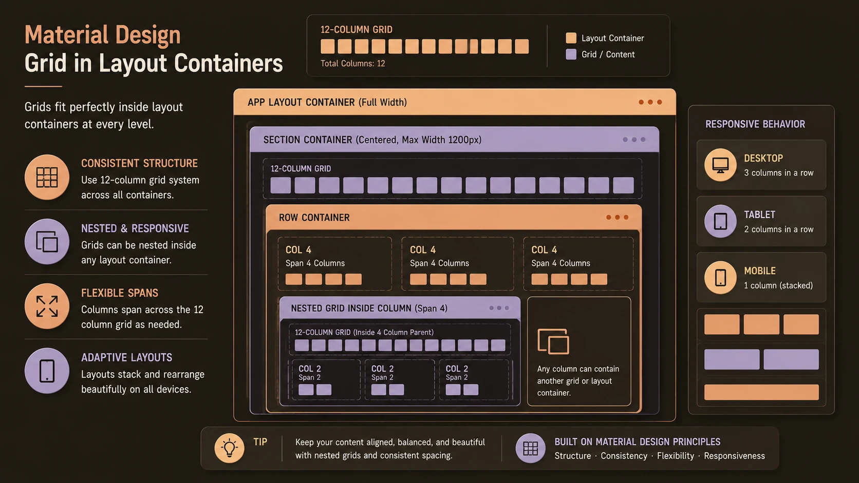
CSS Grid introduces an explicit layout model built around rows and columns.
Rather than relying on document flow to determine positioning, developers define a grid structure and place interface components within it.
Major concepts include:
- ◆Grid containers.
- ◆Grid items.
- ◆Grid tracks.
- ◆Grid lines.
- ◆Grid areas.
- ◆Explicit grids.
- ◆Implicit grids.
- ◆Flexible sizing.
Unlike Flexbox, which focuses primarily on arranging items along a single axis, Grid manages horizontal and vertical positioning together.
Core Architecture
Grid separates document structure from layout definition.
| Component | Responsibility |
|---|---|
| HTML Document | Semantic application structure |
| CSS Grid Container | Defines layout context |
| Grid Tracks | Establish rows and columns |
| Grid Items | Occupy defined grid positions |
| Media Queries | Adapt layouts for different viewports |
| Browser Rendering Engine | Calculates final positioning |
This architecture encourages cleaner separation between content and presentation.
Key Features
Two-Dimensional Layout
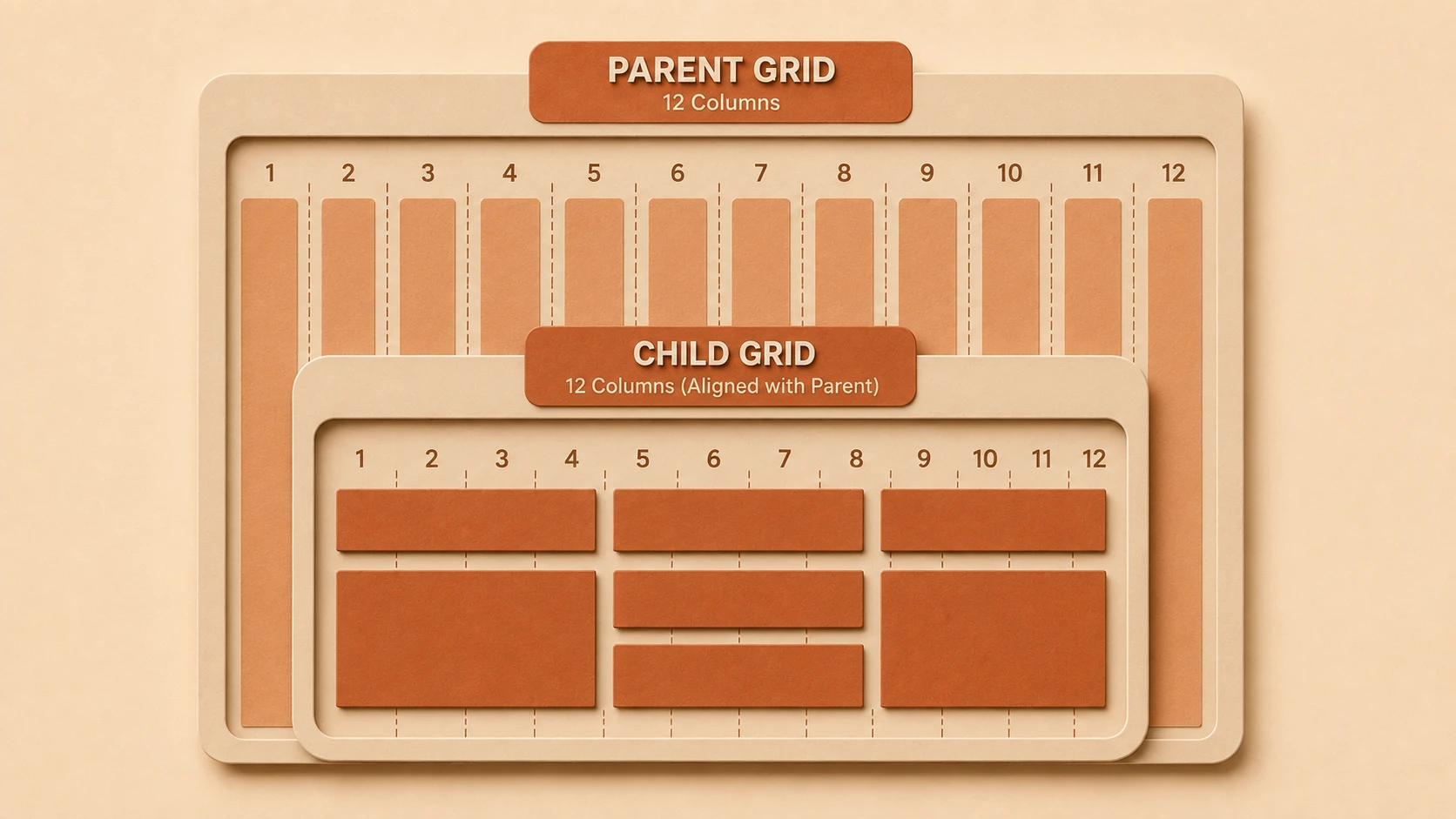
Grid manages rows and columns simultaneously, enabling layouts that would otherwise require multiple nested containers or extensive positioning logic.
Explicit Placement
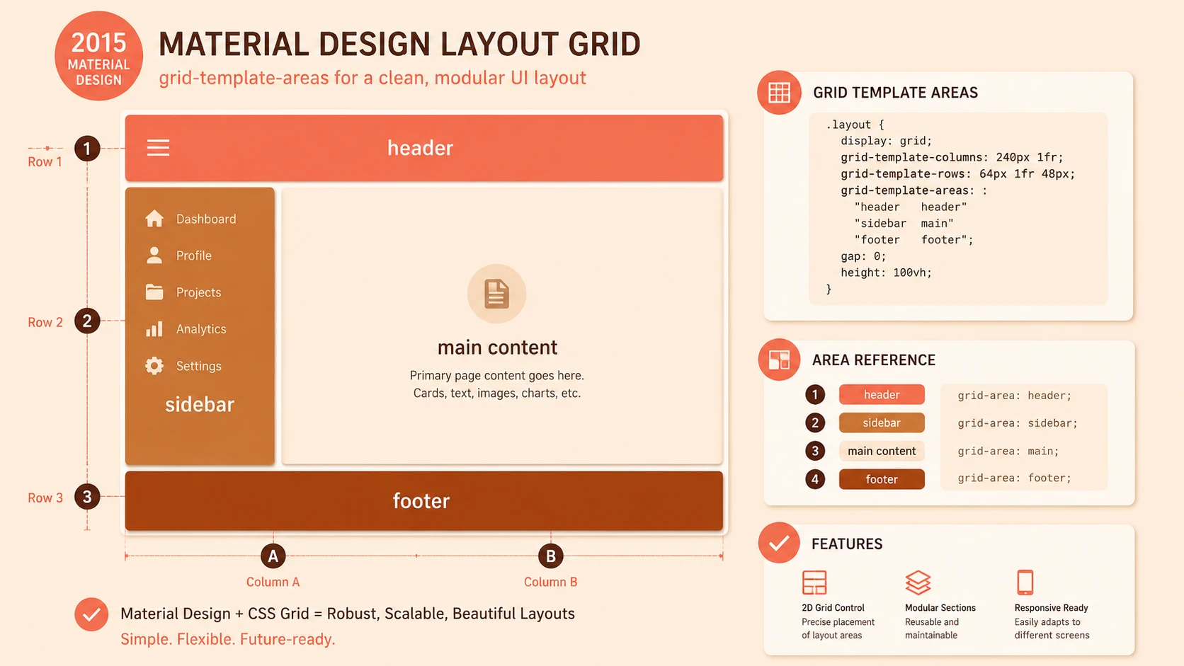
Developers can assign interface components to specific grid locations rather than depending entirely on document order.
Flexible Track Sizing
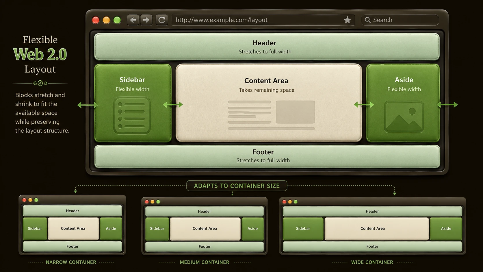
Rows and columns may adapt according to available space while preserving predictable alignment.
Grid Areas
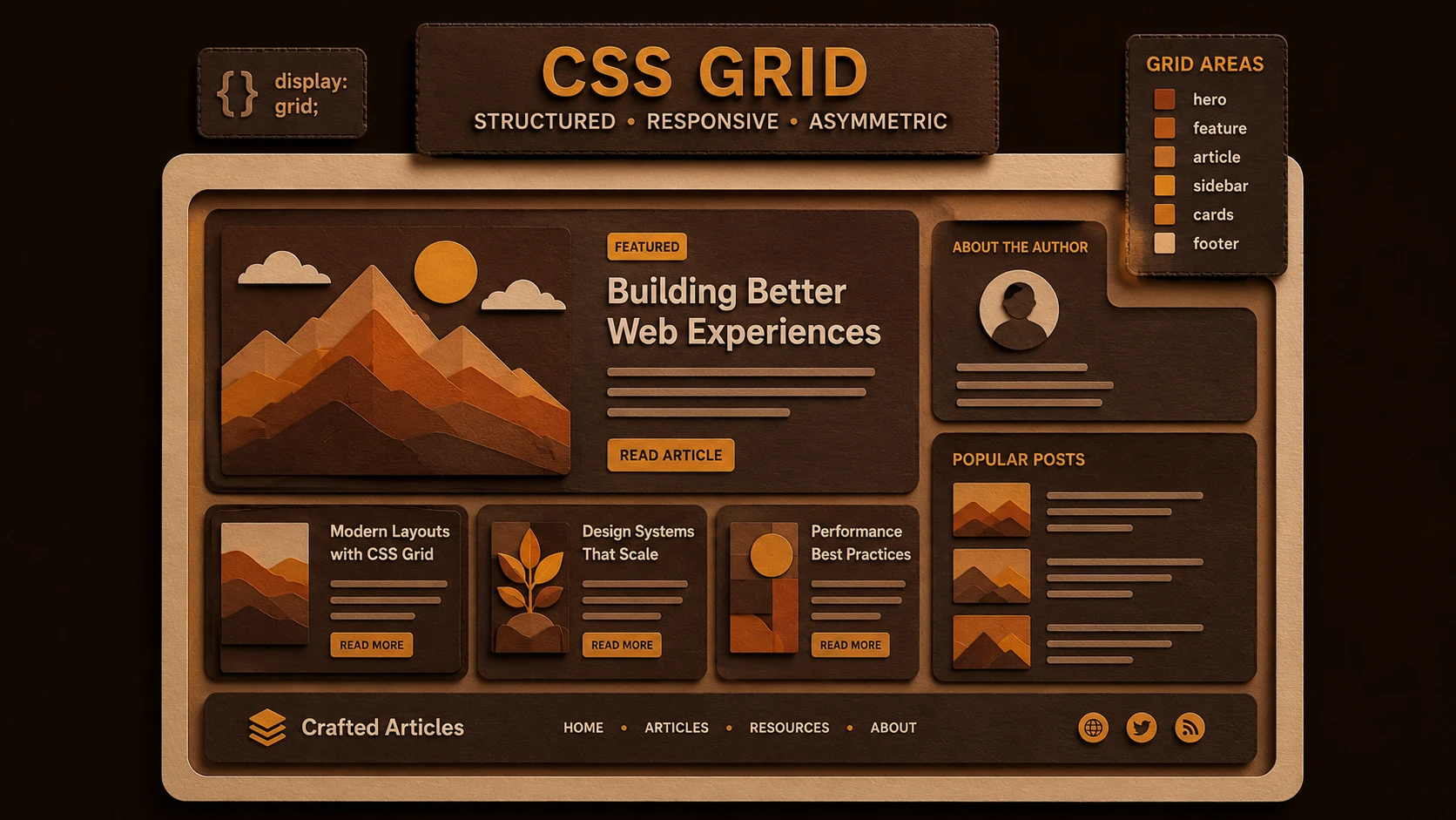
Related cells can be combined into larger named regions representing navigation, content, sidebars, headers, or application panels.
Responsive Design Integration
Grid works naturally alongside media queries, allowing layouts to evolve across desktop, tablet, and mobile devices.
Cleaner Stylesheets
Many layout responsibilities move from complex float calculations into straightforward grid definitions.
How It Works
A simplified rendering workflow appears below.
HTML Structure
      |
Grid Container
      |
Define Rows and Columns
      |
Assign Grid Areas
      |
Browser Layout Engine
      |
Responsive Interface
The browser calculates element placement based on the declared grid structure rather than float behavior.
Enterprise Use Cases
Business Dashboards
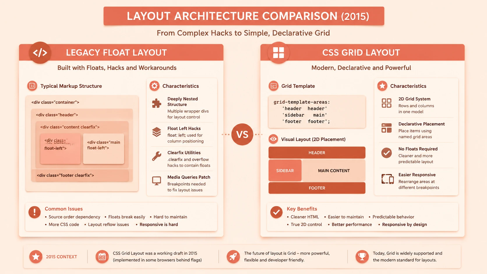
System architecture diagram and conceptual workflow layout for CSS Grid Layout Status.
Analytics panels, charts, filters, and navigation components benefit from structured two-dimensional layouts.
Administrative Portals
Enterprise administration systems frequently contain multiple independent interface regions that align naturally within Grid.
Financial Applications
Complex reporting interfaces requiring precise alignment become easier to organize.
Content Management Systems
Editorial tools often require sophisticated workspace layouts involving navigation, editing, previews, and management panels.
Cloud Management Consoles
Infrastructure monitoring applications can organize operational dashboards using flexible grid-based layouts.
Performance Considerations
CSS Grid primarily affects layout computation rather than application execution.
Organizations should evaluate:
- ◆Rendering efficiency.
- ◆DOM complexity.
- ◆Stylesheet organization.
- ◆Responsive layout calculations.
- ◆Browser implementation performance.
Reducing unnecessary nested markup may improve maintainability while simplifying interface construction.
Security Considerations
CSS Grid introduces presentation capabilities rather than security functionality.
Development teams should continue implementing:
- ◆Secure authentication.
- ◆Authorization.
- ◆HTTPS communication.
- ◆Input validation.
- ◆Content security practices.
Layout improvements should complement established application security architecture.
Scalability
Grid promotes scalable interface engineering by encouraging reusable layout definitions.
Advantages include:
- ◆Cleaner CSS architecture.
- ◆Reduced layout duplication.
- ◆Improved responsive design.
- ◆Easier maintenance.
- ◆Better collaboration between design and development teams.
These characteristics become increasingly valuable as enterprise applications continue expanding.
Best Practices
Organizations evaluating CSS Grid should:
- ◆Preserve semantic HTML.
- ◆Continue using responsive design principles.
- ◆Evaluate browser compatibility carefully.
- ◆Use Grid for page-level layouts where appropriate.
- ◆Continue using Flexbox for one-dimensional alignment tasks.
- ◆Minimize unnecessary nesting.
- ◆Introduce Grid gradually through prototype projects.
These practices allow teams to benefit from Grid while maintaining compatibility with existing production environments.
Common Mistakes
| Mistake | Business Impact |
|---|---|
| Assuming Grid replaces every layout technique | Poor architectural decisions |
| Ignoring browser implementation status | Compatibility issues |
| Depending on experimental features without testing | Production instability |
| Mixing numerous layout systems unnecessarily | Increased maintenance complexity |
| Excessive nesting despite Grid availability | Reduced readability |
| Neglecting responsive validation | Inconsistent user experience |
Avoiding these issues improves long-term maintainability and deployment reliability.
Technology Comparison
| Technology | Primary Purpose | Best Use Case |
|---|---|---|
| Floats | Document flow positioning | Legacy layouts and text wrapping |
| Flexbox | One-dimensional layout | Navigation bars, toolbars, flexible rows and columns |
| CSS Grid Layout | Two-dimensional layout | Complete application pages, dashboards, and complex interfaces |
Rather than replacing Flexbox, CSS Grid complements it by addressing layout scenarios involving coordinated row and column positioning.
Adoption Strategy
Organizations should adopt CSS Grid through measured experimentation.
Recommended roadmap:
- 1.Monitor browser implementation progress.
- 2.Prototype internal applications using Grid.
- 3.Continue using Flexbox where appropriate.
- 4.Reduce dependence on float-based layouts for new projects.
- 5.Develop reusable Grid layout patterns.
- 6.Expand production adoption as browser support matures.
This strategy balances innovation with enterprise stability.
Limitations
As of June 2015, CSS Grid remains under active implementation.
Organizations should recognize several considerations.
- ◆Browser support continues evolving.
- ◆Existing production frameworks remain widely deployed.
- ◆Developer experience with Grid is still growing.
- ◆Some responsive workflows may continue relying on Flexbox and established techniques.
- ◆Cross-browser testing remains essential.
These considerations should guide gradual enterprise adoption.
Looking Ahead
From the perspective of June 2015, CSS Grid Layout represents one of the most promising developments in modern CSS. By introducing a true two-dimensional layout model, it addresses long-standing challenges that have traditionally required complex float-based implementations and deeply nested HTML structures.
At the same time, Grid should not be viewed as a replacement for Flexbox. The two technologies solve different layout problems and are expected to work together within modern front-end architectures. As browser implementations continue maturing and tooling improves, organizations that begin understanding Grid today will be well positioned to build cleaner, more maintainable, and more responsive enterprise interfaces while gradually reducing dependence on historical float-based layout techniques.