Introduction
Enterprise web applications have evolved considerably over the past several years. Business intelligence portals, customer relationship management systems, enterprise resource planning platforms, project management applications, and Software as a Service (SaaS) products increasingly deliver rich browser-based experiences comparable to traditional desktop software.
As user interfaces become more sophisticated, layout architecture becomes just as important as business logic. Enterprise dashboards commonly combine navigation panels, reporting widgets, charts, forms, tables, notifications, and administrative controls on a single page. Building these interfaces in a way that remains responsive, maintainable, and extensible presents a significant engineering challenge.
Bootstrap 3 has rapidly become one of the most widely adopted front-end frameworks by providing a responsive grid system, reusable interface components, and standardized CSS conventions. One of its most valuable capabilities for enterprise development is grid nesting, which allows developers to build hierarchical layouts without sacrificing consistency or responsiveness.
For architects and front-end developers designing large-scale web applications in late 2014, understanding Bootstrap's nested grid architecture is essential for creating scalable dashboard interfaces.
Industry Background
Responsive web design has become a primary requirement for enterprise software. Organizations increasingly expect applications to function across desktop computers, laptops, tablets, and smartphones while minimizing platform-specific development.
Bootstrap 3 embraces a mobile-first philosophy, encouraging developers to design layouts that progressively adapt to larger displays.
Rather than relying on fixed-width layouts or manually positioned interface elements, Bootstrap provides a 12-column responsive grid that enables flexible page composition using predictable CSS classes.
As enterprise interfaces continue growing in complexity, nested grids provide the structural flexibility needed to organize reusable interface components.
The Business Problem
Large enterprise dashboards commonly contain:
- ◆Multi-column layouts
- ◆Navigation sidebars
- ◆Reporting widgets
- ◆Interactive charts
- ◆Data tables
- ◆Search panels
- ◆Administrative forms
- ◆Notification areas
Without a structured layout system, applications often suffer from:
- ◆Inconsistent spacing
- ◆Difficult maintenance
- ◆Poor responsiveness
- ◆Duplicate CSS rules
- ◆Layout regressions
- ◆Increased development effort
Bootstrap's grid system provides a standardized approach to solving these challenges.
Understanding Bootstrap 3 Grid System
Bootstrap 3 organizes page layouts using a responsive 12-column grid.
Each row is divided into twelve equal columns that can be combined to create flexible page structures.
Developers assign column widths using predefined CSS classes.
Examples include:
- ◆col-xs-*
- ◆col-sm-*
- ◆col-md-*
- ◆col-lg-*
These classes allow layouts to adapt automatically based on screen size.
Core Architecture
Bootstrap's layout model is hierarchical.
| Component | Responsibility |
|---|---|
| Container | Defines page boundaries |
| Row | Groups columns horizontally |
| Column | Defines responsive width |
| Nested Row | Creates additional layout levels |
| Component | Displays business functionality |
Maintaining this hierarchy ensures predictable layout behavior across supported devices.
The 12-Column Layout Model
Every Bootstrap row contains up to twelve columns.
Examples include:
| Layout | Column Distribution |
|---|---|
| Two-column layout | 6 + 6 |
| Three-column layout | 4 + 4 + 4 |
| Sidebar with content | 3 + 9 |
| Dashboard widgets | 3 + 3 + 3 + 3 |
This consistent mathematical model simplifies layout planning for development teams.
Understanding Grid Nesting
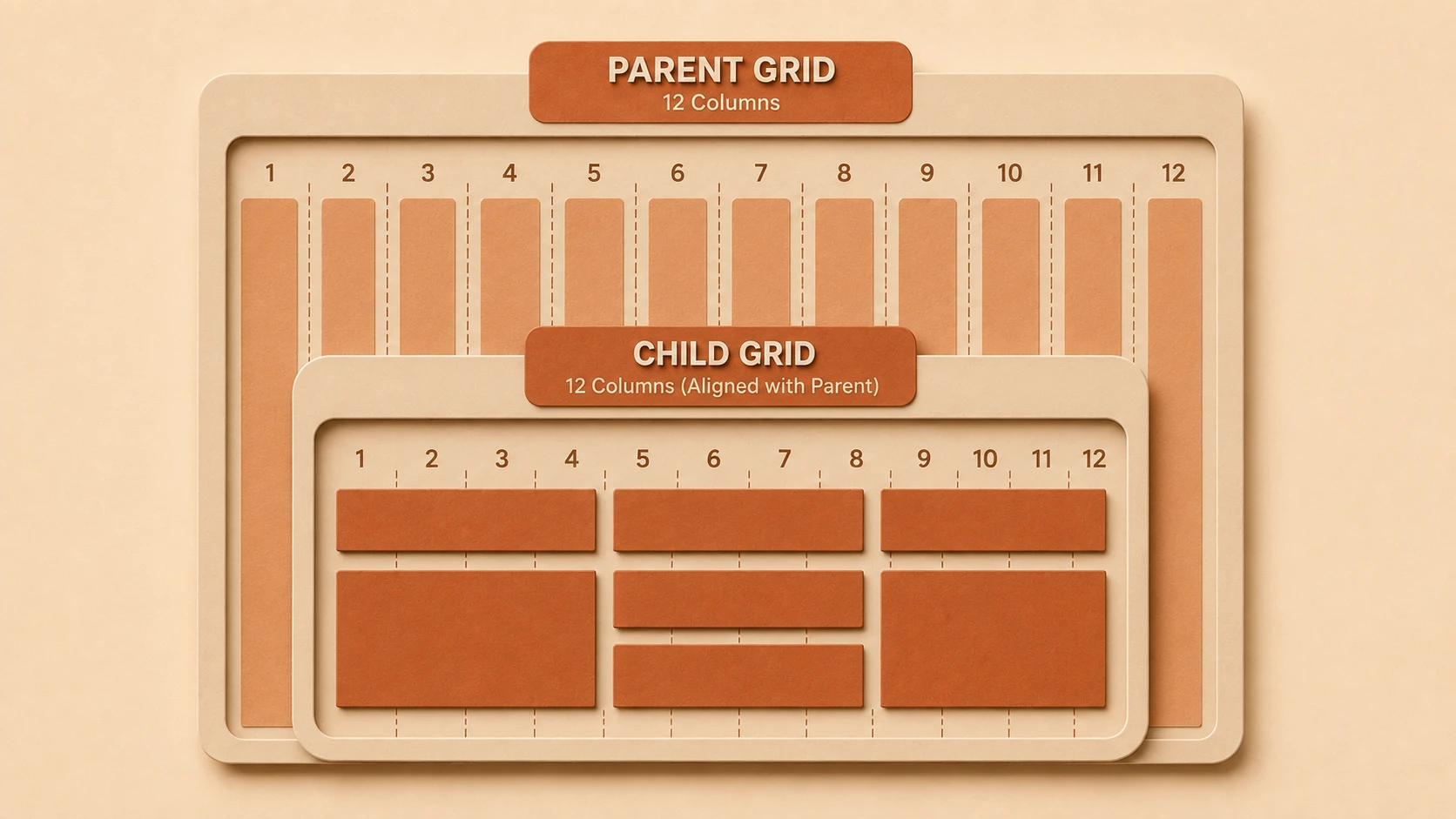
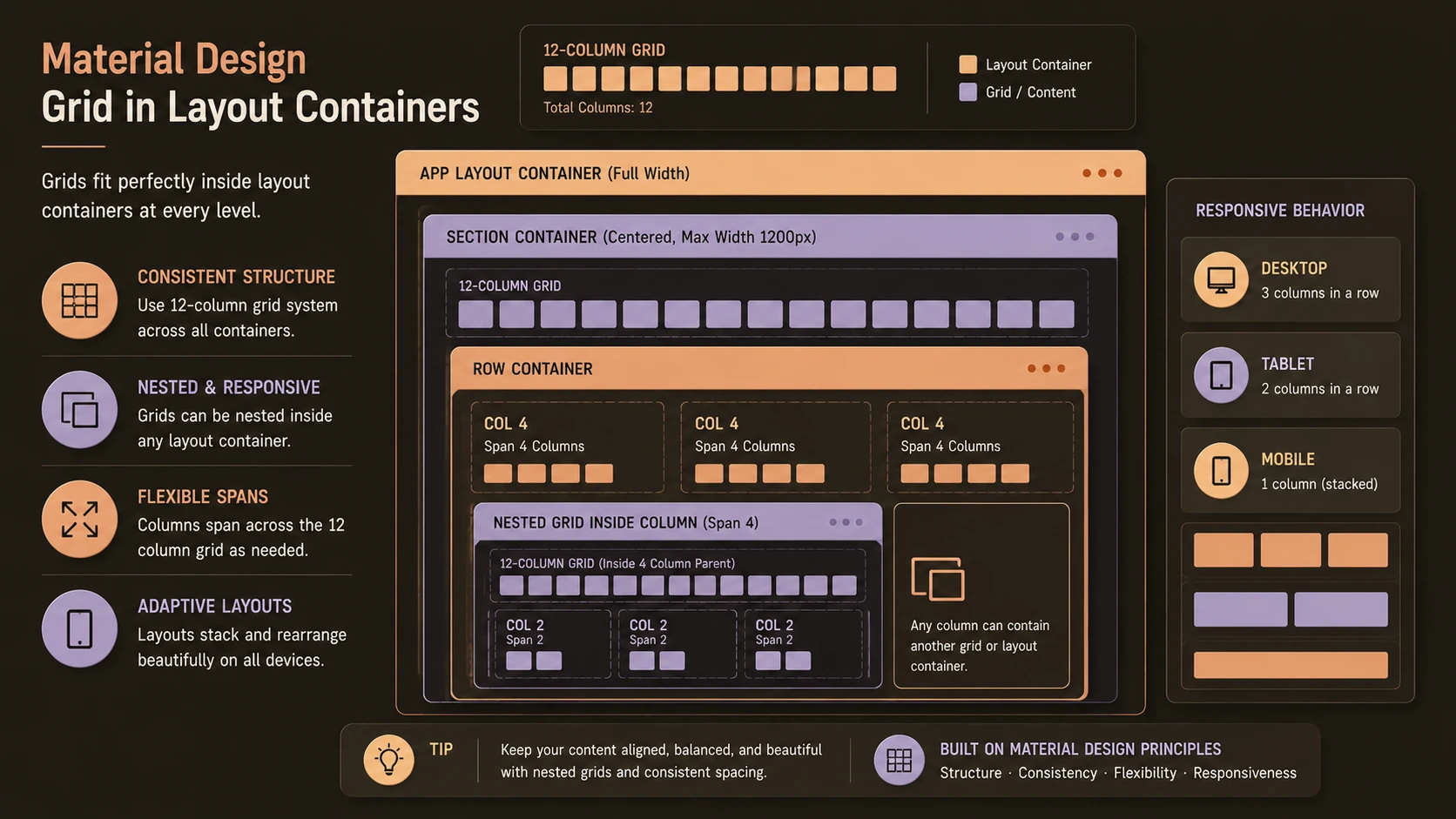
Grid nesting allows developers to place a new row inside an existing column.
Rather than limiting applications to a single layout level, nested grids create independent layout structures within larger page sections.
A typical hierarchy follows this pattern:
Container
 └── Row
      ├── Column
      │     └── Nested Row
      │            ├── Column
      │            └── Column
      └── Column
Each nested row starts a new twelve-column layout within its parent column.
This allows highly structured dashboard interfaces while maintaining Bootstrap's responsive behavior.
Building Enterprise Dashboards
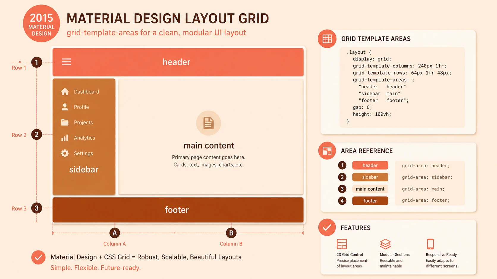
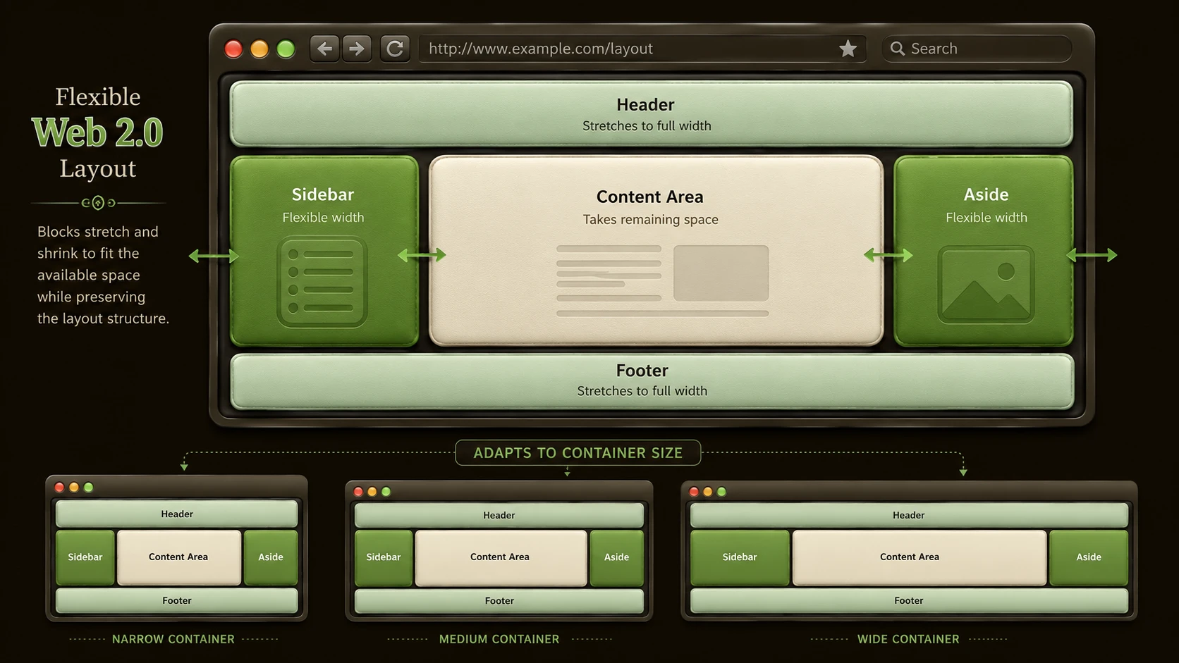
Enterprise dashboards often require several independent layout regions.
A representative structure might include:
- ◆Top navigation
- ◆Left navigation panel
- ◆Main reporting area
- ◆Summary widgets
- ◆Activity feed
- ◆Charts
- ◆Data tables
- ◆Footer
Using nested grids, each region can contain its own internal layout without affecting surrounding components.
This modular structure improves readability and simplifies future enhancements.
Responsive Behavior
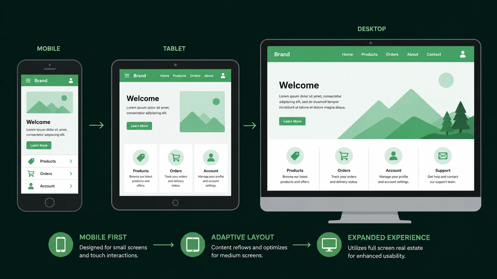
Bootstrap's responsive classes allow nested layouts to adapt automatically.
Developers may specify different column widths for various screen sizes.
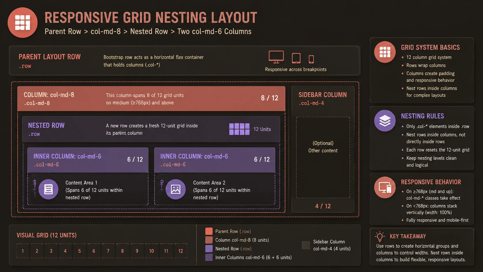
Fluid CSS grid column grid framework for responsive container widths.
Examples include:
- ◆Full-width widgets on mobile devices
- ◆Two-column layouts on tablets
- ◆Multi-column dashboards on desktop systems
This flexibility enables a single application to support diverse client devices without maintaining multiple layout implementations.
Modular Interface Design
Nested grids naturally support modular user interface development.
Independent components can include:
- ◆Reporting widgets
- ◆Search panels
- ◆User management modules
- ◆Notification panels
- ◆Analytics summaries
- ◆Navigation sections
Each module can evolve independently while maintaining consistent alignment within the overall dashboard.
Enterprise Use Cases
| Scenario | Benefit |
|---|---|
| Business Intelligence Dashboards | Structured analytics layouts |
| CRM Systems | Flexible customer management screens |
| ERP Applications | Organized operational dashboards |
| SaaS Administration Portals | Modular interface composition |
| Financial Reporting Systems | Responsive analytical views |
| Monitoring Dashboards | Reusable visualization components |
Organizations developing enterprise portals benefit from predictable layout structures that simplify long-term maintenance.
Performance Considerations
Bootstrap's CSS grid introduces relatively little overhead when used appropriately.
Performance recommendations include:
- ◆Avoid excessive nesting.
- ◆Minimize unnecessary markup.
- ◆Reuse layout components.
- ◆Organize styles consistently.
- ◆Optimize supporting JavaScript and images.
Readable HTML often contributes more to maintainability than aggressive layout optimization.
Security Considerations
Bootstrap focuses on presentation rather than application security.
Organizations should continue implementing:
- ◆Authentication
- ◆Authorization
- ◆HTTPS
- ◆Input validation
- ◆Cross-site scripting protection
Responsive layouts should complement secure application architecture rather than replace it.
Scalability
Grid nesting contributes to scalable interface design by supporting:
- ◆Modular layouts
- ◆Independent UI components
- ◆Reusable dashboard sections
- ◆Simplified maintenance
- ◆Team-based development
Well-organized layouts reduce the cost of adding new dashboard functionality.
Best Practices
Enterprise development teams should consider the following practices:
- ◆Maintain consistent row and column hierarchy.
- ◆Keep nesting levels reasonable.
- ◆Build reusable dashboard components.
- ◆Follow Bootstrap naming conventions.
- ◆Design layouts from a mobile-first perspective.
- ◆Test across supported browsers and screen sizes.
- ◆Separate layout structure from business logic.
- ◆Review layout consistency during code reviews.
These practices improve both maintainability and collaboration.
Common Mistakes
Common implementation issues include:
- ◆Nesting rows outside columns.
- ◆Excessively deep layout hierarchies.
- ◆Ignoring responsive breakpoints.
- ◆Mixing custom layout systems with Bootstrap inconsistently.
- ◆Creating unnecessary wrapper elements.
- ◆Embedding presentation logic within application code.
Careful architectural planning helps prevent layout complexity from growing over time.
Technology Comparison
| Capability | Traditional Fixed Layout | Bootstrap 3 Grid System |
|---|---|---|
| Responsive Design | Limited | Native support |
| Layout Consistency | Manual | Standardized |
| Nested Layouts | Custom implementation | Built-in support |
| Mobile Adaptation | Difficult | Mobile-first approach |
| Reusable Components | Limited | Strong support |
| Enterprise Maintainability | Moderate | Improved |
Bootstrap's structured grid reduces the amount of custom layout code required for large applications.
Adoption Strategy
Organizations adopting Bootstrap 3 should establish layout standards early.
A recommended approach includes:
- 1.Define a common dashboard structure.
- 2.Standardize grid usage across teams.
- 3.Create reusable interface modules.
- 4.Limit unnecessary nesting.
- 5.Validate responsive behavior during development.
- 6.Perform cross-browser testing.
- 7.Document layout conventions for future projects.
Consistent implementation practices simplify long-term application evolution.
Limitations
Although Bootstrap 3's grid system simplifies responsive design, several considerations remain.
Current limitations include:
- ◆Excessive nesting can reduce HTML readability.
- ◆Highly customized layouts may require additional CSS.
- ◆Large applications benefit from disciplined component organization.
- ◆Responsive testing remains essential across supported devices.
Bootstrap provides a flexible foundation, but successful dashboard design still depends on sound front-end architecture.
Looking Ahead
As of October 2014, Bootstrap 3 has become an important framework for enterprise web development by standardizing responsive layouts and reducing the complexity of cross-device interface design. Its grid nesting capabilities allow architects to build sophisticated dashboard interfaces while maintaining modularity and predictable responsiveness.
Organizations developing business applications, analytics portals, and SaaS platforms should view grid nesting as more than a layout technique. When combined with reusable interface components and disciplined front-end architecture, it provides a scalable foundation for enterprise dashboards capable of evolving alongside changing business requirements and growing application complexity.