Introduction
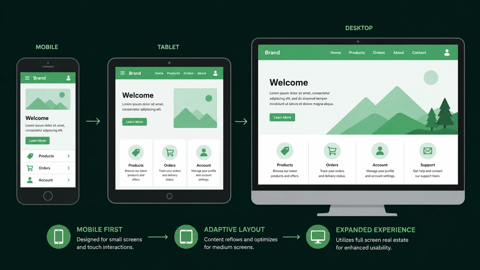
Responsive Web Design has rapidly evolved from a desirable capability into an architectural requirement for modern web applications. Organizations are expected to deliver consistent experiences across smartphones, tablets, laptops, and desktop computers without maintaining multiple versions of the same application.
Bootstrap has become one of the most widely adopted front-end frameworks by simplifying interface development through standardized CSS, reusable components, and responsive layouts. With Bootstrap 3.0, the framework undergoes its most significant architectural redesign since its introduction by embracing a mobile-first philosophy.
From the perspective of March 2013, this release represents more than a visual refresh. It reflects a broader industry movement toward designing for constrained mobile devices first before progressively enhancing interfaces for larger displays.
Industry Background
The rapid growth of smartphones and tablets has fundamentally changed how web applications are consumed. Desktop computers are no longer the only primary access point for enterprise applications.
Development teams increasingly face requirements such as:
- ◆Responsive layouts.
- ◆Cross-device compatibility.
- ◆Consistent user experience.
- ◆Faster front-end development.
- ◆Standardized UI components.
- ◆Maintainable CSS architecture.
Earlier versions of Bootstrap successfully accelerated interface development, but many projects still approached responsive design by adapting desktop layouts to smaller screens.
Bootstrap 3.0 instead encourages developers to begin with mobile interfaces and progressively expand functionality as additional screen space becomes available.
The Business Problem
Enterprise front-end projects often encounter several challenges.
- ◆Multiple device resolutions.
- ◆Duplicate CSS rules.
- ◆Inconsistent component styling.
- ◆Long development cycles.
- ◆Browser compatibility concerns.
- ◆Difficult UI maintenance.
- ◆Fragmented design standards.
Without a unified framework, development teams frequently implement inconsistent interface solutions that increase maintenance costs and reduce productivity.
Bootstrap aims to provide a common design language while reducing repetitive front-end engineering work.
Understanding the Technology
Bootstrap is a front-end framework consisting of CSS, reusable UI components, responsive grid utilities, and JavaScript plugins.
Bootstrap 3.0 introduces several architectural improvements.
Core capabilities include:
- ◆Mobile-first CSS.
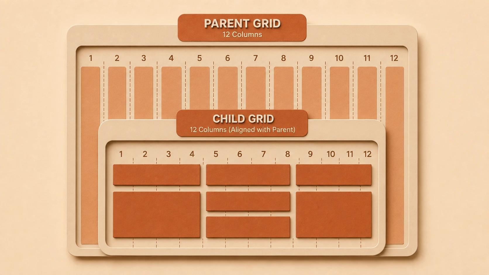
- ◆Responsive grid system.
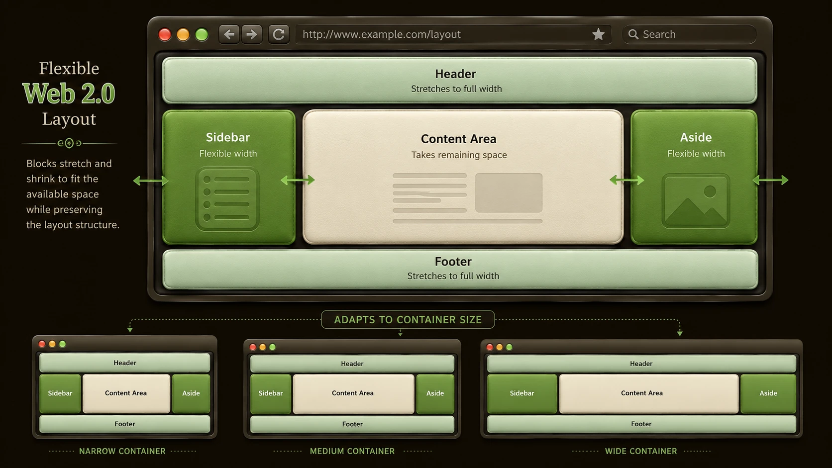
- ◆Fluid layouts.
- ◆Reusable interface components.
- ◆Form controls.
- ◆Navigation components.
- ◆Typography utilities.
- ◆JavaScript plugins.
The framework emphasizes progressive enhancement, allowing layouts to adapt naturally as viewport size increases.
Core Architecture
Bootstrap 3.0 organizes interface development around modular components.
| Component | Responsibility |
|---|---|
| Grid System | Responsive page layout |
| CSS Components | Visual styling |
| Utility Classes | Common formatting |
| JavaScript Plugins | Interactive behaviors |
| Responsive Utilities | Device-specific visibility |
| Forms | Standardized user input |
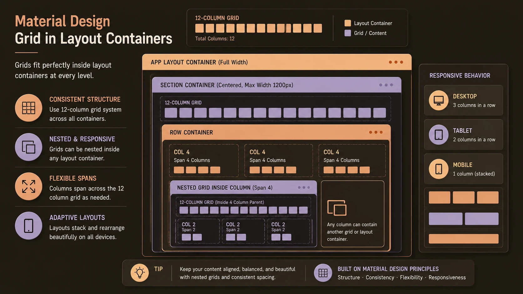
The responsive grid forms the structural foundation upon which interface components are built.
Key Features
Mobile-First Grid
Grid definitions begin with small-screen layouts before expanding through media queries for tablets and desktop displays.
Responsive Components
Navigation bars, forms, buttons, alerts, and other components automatically adapt to varying viewport sizes.
Simplified CSS Architecture
Bootstrap 3.0 refactors many existing styles to improve maintainability and consistency.
Improved Customization
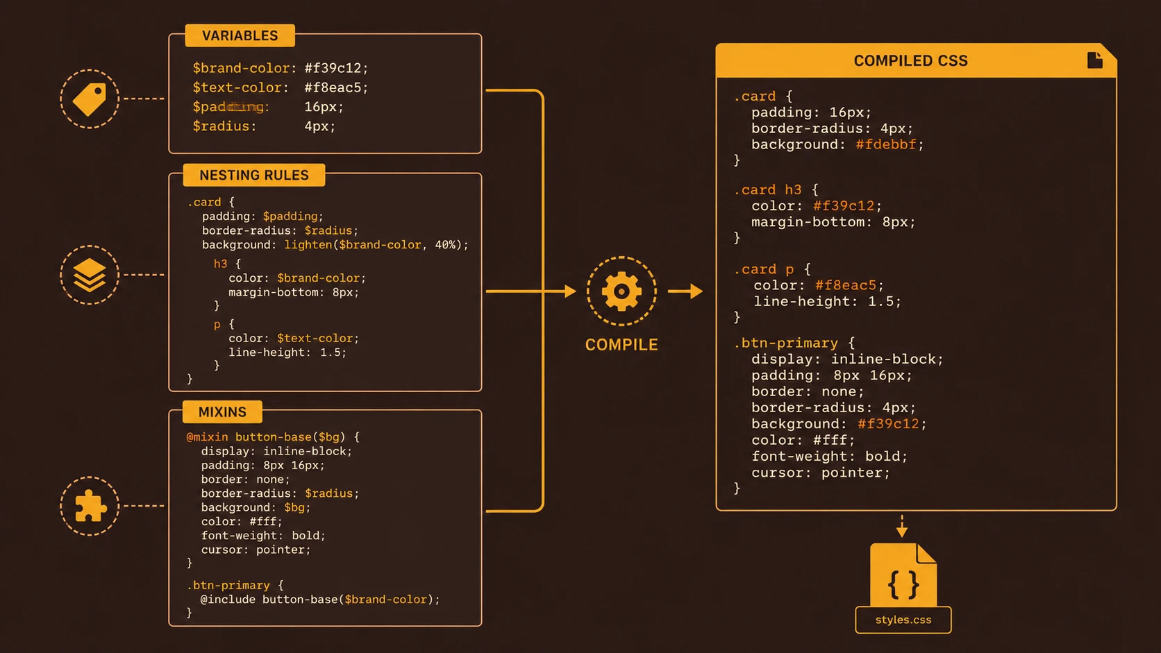
Developers can more easily modify framework behavior using CSS preprocessors such as LESS.
Standardized User Interface
Applications maintain consistent visual patterns across projects and development teams.
Cross-Browser Support
Bootstrap continues to provide abstractions that reduce browser-specific styling challenges.
How It Works
A simplified rendering workflow is illustrated below.
Developer
      |
Bootstrap CSS and Components
      |
Responsive Grid System
      |
Media Queries
      |
Browser Rendering Engine
      |
Desktop, Tablet and Mobile Layouts
The browser evaluates viewport dimensions and applies the appropriate responsive rules during rendering.
Enterprise Use Cases
Bootstrap 3.0 supports numerous enterprise development scenarios.
Corporate Portals
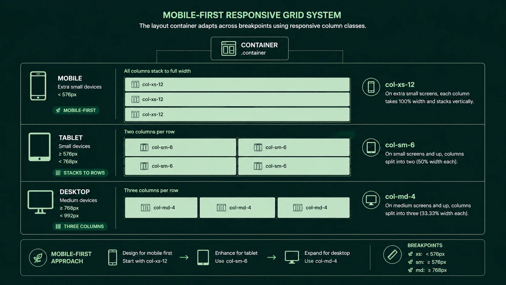
Fluid CSS grid column grid framework for responsive container widths.
Employee portals benefit from consistent navigation and responsive layouts across multiple devices.
Customer Self-Service Applications
Organizations can deliver unified experiences for desktop and mobile users without maintaining separate codebases.
Administrative Dashboards
Responsive grids simplify the presentation of business metrics across varying display sizes.
Software-as-a-Service Platforms
Standardized UI components accelerate feature development while maintaining design consistency.
Public Websites
Marketing websites benefit from responsive layouts and reduced front-end implementation effort.
Performance Considerations
Although Bootstrap accelerates development, performance optimization remains important.
Development teams should consider:
- ◆CSS file size.
- ◆JavaScript plugin usage.
- ◆Image optimization.
- ◆Responsive image strategies.
- ◆Browser rendering efficiency.
Only necessary components should be included to minimize download size and improve page responsiveness.
Security Considerations
Bootstrap primarily addresses presentation rather than application security.
Organizations should continue implementing:
- ◆Secure authentication.
- ◆Server-side validation.
- ◆HTTPS communication.
- ◆Protection against cross-site scripting.
- ◆Secure session management.
Framework adoption should complement, rather than replace, established security practices.
Scalability
Bootstrap encourages scalable interface development through reusable components and standardized styling.
Scalable advantages include:
- ◆Shared design language.
- ◆Reusable UI elements.
- ◆Modular component architecture.
- ◆Easier team collaboration.
- ◆Consistent responsive behavior.
As applications grow, standardized front-end patterns simplify maintenance and onboarding.
Best Practices
Organizations adopting Bootstrap 3.0 should:
- ◆Design mobile layouts first.
- ◆Use the responsive grid consistently.
- ◆Reuse framework components whenever possible.
- ◆Customize styles through preprocessors instead of modifying core framework files.
- ◆Maintain semantic HTML structure.
- ◆Optimize front-end assets for production deployment.
- ◆Establish organization-wide UI standards.
These practices improve maintainability and reduce long-term development effort.
Common Mistakes
| Mistake | Business Impact |
|---|---|
| Designing desktop layouts first | Reduced mobile usability |
| Excessive component customization | Difficult framework upgrades |
| Ignoring responsive testing | Device compatibility issues |
| Overloading pages with unnecessary plugins | Lower performance |
| Mixing inconsistent CSS conventions | Increased maintenance effort |
| Editing framework source directly | Upgrade complexity |
Following framework conventions improves consistency and simplifies future maintenance.
Technology Comparison
| Feature | Bootstrap 2.x | Bootstrap 3.0 |
|---|---|---|
| Design Philosophy | Desktop-first | Mobile-first |
| Grid System | Responsive support | Refactored responsive grid |
| CSS Architecture | Earlier component structure | Simplified and modernized |
| Responsive Utilities | Basic | Expanded |
| LESS Integration | Available | Improved customization |
Bootstrap 3.0 represents a significant architectural evolution rather than an incremental update.
Adoption Strategy
Organizations evaluating Bootstrap 3.0 should adopt it strategically.
Recommended roadmap:
- 1.Begin new projects using the mobile-first grid.
- 2.Establish responsive design standards.
- 3.Standardize reusable interface components.
- 4.Integrate LESS compilation into build processes.
- 5.Validate layouts across representative devices.
- 6.Document internal UI conventions.
A structured adoption strategy helps maximize framework benefits while maintaining consistency across development teams.
Limitations
Although Bootstrap provides substantial productivity improvements, organizations should recognize several considerations.
- ◆Framework customization requires planning.
- ◆Generic visual styles may require branding adjustments.
- ◆Existing Bootstrap 2.x applications may require migration effort.
- ◆Performance depends on selective component usage.
- ◆Responsive testing remains essential across supported browsers and devices.
Bootstrap should be viewed as a foundation rather than a complete design solution.
Looking Ahead
From the perspective of March 2013, Bootstrap 3.0's mobile-first redesign reflects one of the most important shifts in modern front-end development. As smartphones continue influencing enterprise application requirements, designing for smaller screens before larger displays offers a practical methodology for building adaptable user interfaces.
Combined with responsive design principles and CSS preprocessors, Bootstrap 3.0 provides organizations with a standardized approach to front-end engineering that can improve developer productivity, reduce interface inconsistencies, and simplify long-term maintenance. Its continued success will depend on community adoption, framework maturity, and its ability to evolve alongside rapidly changing browser capabilities and device ecosystems.