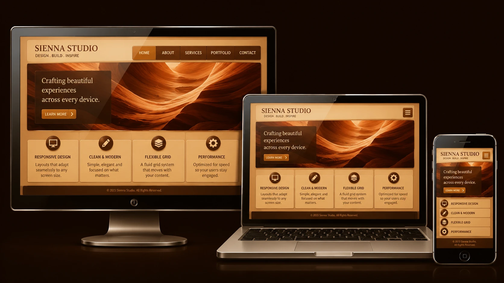
The web is no longer consumed exclusively on desktop computers. Over the past few years, the rapid growth of smartphones, netbooks, and mobile internet devices has fundamentally changed how users access enterprise applications and public websites. Organizations that once optimized exclusively for 1024-pixel desktop monitors are now finding themselves supporting a growing range of screen sizes, browser capabilities, and interaction models.
Historically, many organizations have addressed this challenge by maintaining separate desktop and mobile websites. While this approach can provide optimized experiences for different devices, it also introduces additional development, testing, deployment, and maintenance costs.
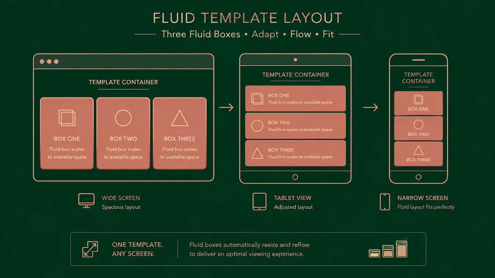
An emerging design philosophy known as Responsive Web Design (RWD) proposes a different solution. Rather than creating multiple versions of the same website, responsive design combines fluid layouts, flexible media, and CSS3 media queries to create interfaces that adapt automatically to the available screen space.
Although responsive web design is still an emerging concept in 2010, it offers an exciting direction for organizations seeking to simplify long-term web development while improving accessibility across an increasingly diverse device landscape.
The Changing Landscape of Web Access
Only a few years ago, enterprise web development focused primarily on desktop browsers such as Internet Explorer, Firefox, and Safari running on standard monitor resolutions. Today, users increasingly browse websites from:
- ◆Apple iPhone
- ◆Android smartphones
- ◆BlackBerry devices
- ◆Windows Mobile phones
- ◆Netbooks
- ◆Small notebooks
- ◆Large widescreen desktop monitors
Each device presents unique challenges including:
- ◆Different screen resolutions
- ◆Touch versus mouse input
- ◆Variable network speeds
- ◆Browser feature differences
- ◆Orientation changes
- ◆Memory limitations
Supporting every device with separate websites quickly becomes expensive and difficult to maintain.
Traditional Approaches to Mobile Websites
Most organizations currently choose one of three approaches.
| Approach | Advantages | Limitations |
|---|---|---|
| Fixed-width desktop site | Simple development | Poor mobile experience |
| Separate mobile website | Optimized mobile interface | Duplicate maintenance |
| Device-specific applications | Excellent user experience | Platform-specific development |
While dedicated mobile sites remain common, maintaining duplicate code bases often results in inconsistent content, delayed feature updates, and increased operational costs.
Responsive web design aims to reduce these challenges by allowing a single website to adapt dynamically to different viewing environments.
What Is Responsive Web Design?
Responsive web design combines several web technologies to build layouts that respond intelligently to the user's device.
Its primary building blocks include:
- ◆Fluid grids
- ◆Flexible layouts
- ◆Flexible images
- ◆CSS3 media queries
Instead of defining page elements with fixed pixel dimensions, designers increasingly rely on proportional measurements that allow content to scale naturally.
The browser determines how content should be displayed based on available screen dimensions and rendering capabilities.
Understanding Fluid Grids
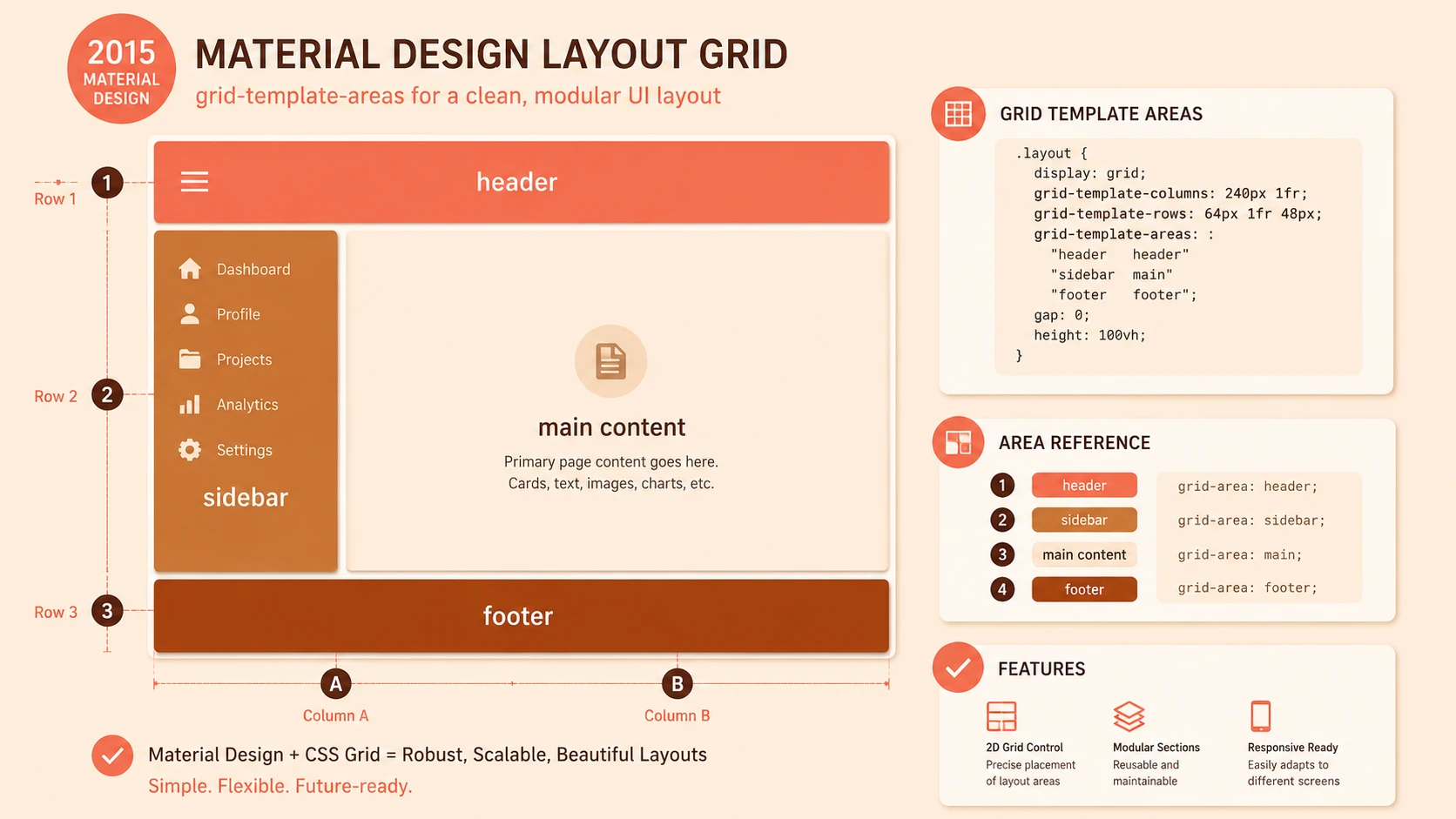
Traditional websites frequently rely on layouts similar to:
Page Width: 960px

Header
Navigation
Content (620px)
Sidebar (300px)
Footer
While predictable, fixed-width layouts often require horizontal scrolling on smaller displays.
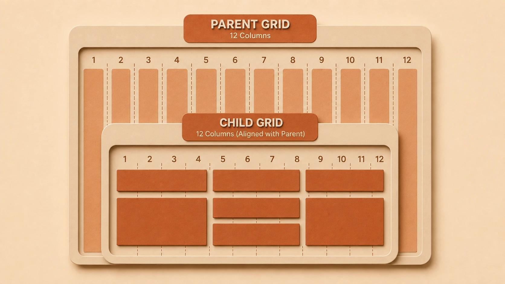
Fluid grids replace absolute pixel measurements with relative percentages.
For example:
| Element | Fixed Layout | Fluid Layout |
|---|---|---|
| Main Content | 620px | 65% |
| Sidebar | 300px | 31% |
| Margins | Fixed pixels | Relative spacing |
As browser width changes, each section automatically adjusts proportionally.
Benefits include:
- ◆Better use of available space
- ◆Improved readability
- ◆Fewer layout adjustments
- ◆Greater flexibility across devices
Flexible Images
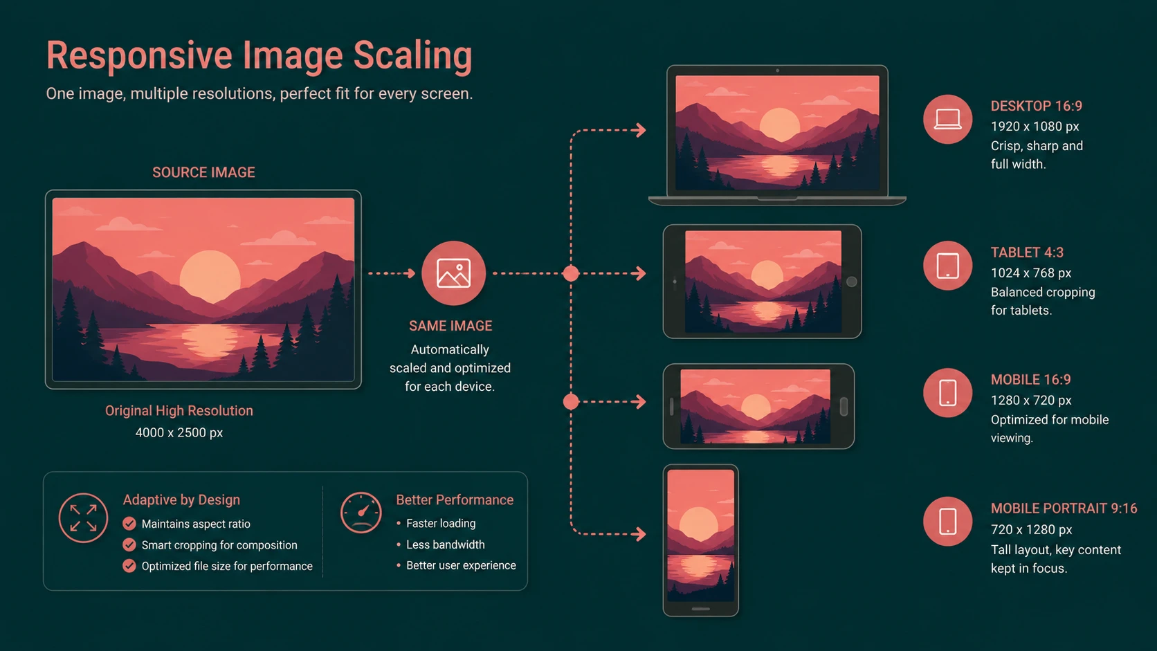
Large desktop images often exceed the available space on mobile devices.
Responsive design encourages images that scale with their containing elements.
Instead of assuming every visitor has a large monitor, images resize naturally as layouts shrink.
Typical CSS may resemble:
img {
    max-width: 100%;
    height: auto;
}
This simple technique helps prevent images from breaking page layouts while maintaining their aspect ratios.
Developers should also balance image quality with download size, particularly for users accessing websites over slower mobile networks.
Introducing CSS3 Media Queries
Perhaps the most exciting component of responsive design is the introduction of CSS3 media queries.
Media queries allow designers to apply different style rules depending on characteristics of the viewing device.
Possible conditions include:
- ◆Screen width
- ◆Screen height
- ◆Device orientation
- ◆Media type
Example:
@media screen and (max-width: 768px) {

    #navigation {
        width: 100%;
    }

    #sidebar {
        display: none;
    }

}
Instead of maintaining multiple websites, developers can progressively adjust layouts as screen size changes.
Although browser support continues to evolve, media queries represent an important step toward adaptive web interfaces.
Architecture of a Responsive Enterprise Website
A responsive website separates presentation from content while allowing the same information to be consumed across multiple devices.
Browser
     |
HTML Structure
     |
CSS Layout Engine
     |
Media Queries
     |
Device Specific Presentation
Content remains consistent while presentation adapts dynamically.
This aligns well with long-standing web development principles emphasizing semantic markup and separation of concerns.
Enterprise Benefits
Responsive web design offers several advantages for organizations.
Lower Maintenance Costs
Maintaining one website instead of separate desktop and mobile versions can reduce:
- ◆Duplicate templates
- ◆Duplicate testing
- ◆Content synchronization
- ◆Deployment complexity
Improved Content Consistency
When a single content source serves every device, updates become available immediately across all supported platforms.
Better Future Flexibility
As additional screen sizes appear, responsive layouts may require fewer structural changes than fixed-width designs.
Rather than targeting individual devices, developers design for ranges of screen dimensions.
Improved Brand Consistency
Customers encounter a unified visual identity regardless of the device they choose.
Enterprise Use Cases
Responsive design has practical applications across many industries.
Financial Services
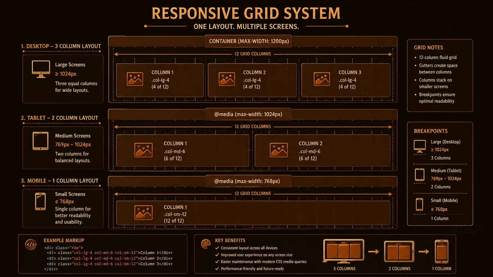
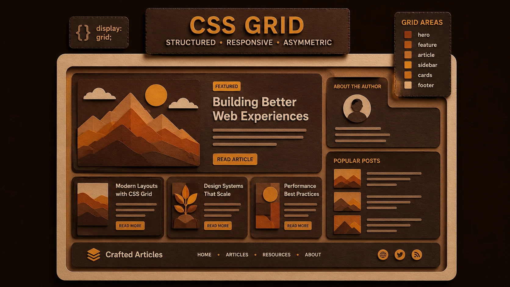
System architecture diagram and conceptual workflow layout for Responsive Web Design.
Customers increasingly access:
- ◆Account summaries
- ◆Loan information
- ◆Branch locators
- ◆Financial calculators
from both desktop and mobile browsers.
Retail
Retail organizations benefit from:
- ◆Product browsing
- ◆Store locations
- ◆Promotional campaigns
- ◆Shopping assistance
across multiple devices.
Healthcare
Healthcare portals may support:
- ◆Appointment requests
- ◆Physician directories
- ◆Health information
- ◆Patient education resources
without requiring separate mobile websites.
Government
Government agencies publishing public information can improve accessibility for citizens using a wide variety of devices.
Browser Compatibility Considerations
Responsive design depends on modern CSS capabilities that are still maturing.
Enterprise teams should evaluate browser compatibility carefully.
| Browser | General Considerations |
|---|---|
| Internet Explorer 8 | Limited CSS3 support |
| Firefox | Strong standards support |
| Safari | Good CSS support |
| Google Chrome | Rapidly evolving standards support |
| Opera | Good standards compliance |
Organizations supporting older browsers should ensure that websites remain functional even if advanced responsive features are unavailable.
Progressive enhancement remains an effective strategy.
Performance Matters
Responsive layouts should not increase page weight unnecessarily.
Developers should:
- ◆Minimize CSS files
- ◆Compress images
- ◆Reduce HTTP requests
- ◆Optimize JavaScript
- ◆Cache static resources
Mobile users frequently experience slower network connections than desktop users.
Performance therefore becomes an important aspect of user experience.
Best Practices for Responsive Design
Organizations adopting responsive techniques should consider the following recommendations.
Design Flexible Layouts First
Avoid designing exclusively for a single screen width.
Instead, think about how content should flow naturally as available space changes.
Prioritize Content
Small screens make content prioritization essential.
Important business information should remain accessible without excessive scrolling.
Simplify Navigation
Navigation structures should remain usable on both large and small displays.
Complex multi-level navigation may require alternative presentation methods on smaller screens.
Use Relative Measurements
Whenever practical, prefer:
- ◆Percentages
- ◆em units
- ◆Relative spacing
rather than fixed pixel values.
Test Frequently
Developers should evaluate layouts across multiple browsers and device sizes throughout development rather than waiting until final testing.
Common Mistakes
Early responsive implementations often encounter several challenges.
Treating Responsive Design as Mobile Design
Responsive design is not exclusively about smartphones.
It aims to provide an effective experience across the entire spectrum of viewing environments.
Ignoring Performance
Large desktop assets delivered unchanged to mobile devices can significantly reduce usability.
Overusing Fixed Widths
Introducing fixed-width elements into otherwise fluid layouts often produces inconsistent behavior.
Testing Only Desktop Browsers
Responsive behavior should be validated on actual mobile devices whenever possible.
Desktop browser resizing cannot always reproduce every mobile browsing characteristic.
Forgetting Touch Interaction
Buttons, links, and navigation elements should remain usable without precise mouse control.
Migration Strategy for Existing Enterprise Websites
Organizations rarely rebuild enterprise websites from scratch.
A phased migration often produces better results.
Recommended approach:
- 1.Audit existing layouts.
- 2.Replace fixed-width containers with flexible grids.
- 3.Introduce relative measurements.
- 4.Optimize images.
- 5.Add media queries incrementally.
- 6.Validate browser compatibility.
- 7.Expand responsive coverage across additional sections.
Incremental adoption reduces project risk while allowing development teams to gain experience with responsive techniques.
Responsive Design Versus Separate Mobile Sites
| Responsive Design | Separate Mobile Site |
|---|---|
| Single code base | Multiple code bases |
| Easier content synchronization | Duplicate content management |
| Consistent branding | Potential design differences |
| Emerging browser support requirements | Mature implementation approach |
| Flexible for varying screen sizes | Often optimized for specific devices |
Both approaches remain viable depending on organizational priorities, available resources, and browser support requirements.
Looking Ahead
The diversity of internet-connected devices shows no sign of slowing. As smartphones, portable computers, and new browsing platforms continue to evolve, enterprise websites must become more adaptable without dramatically increasing development complexity.
Responsive web design presents a promising direction by combining fluid grids, flexible media, and CSS3 media queries into a unified design philosophy. Although browser support and implementation techniques are still developing in 2010, organizations that begin experimenting with responsive principles today can build valuable experience while preparing their web platforms for an increasingly device-diverse future. Careful planning, progressive enhancement, and adherence to web standards will be key factors in successfully adopting this emerging approach.