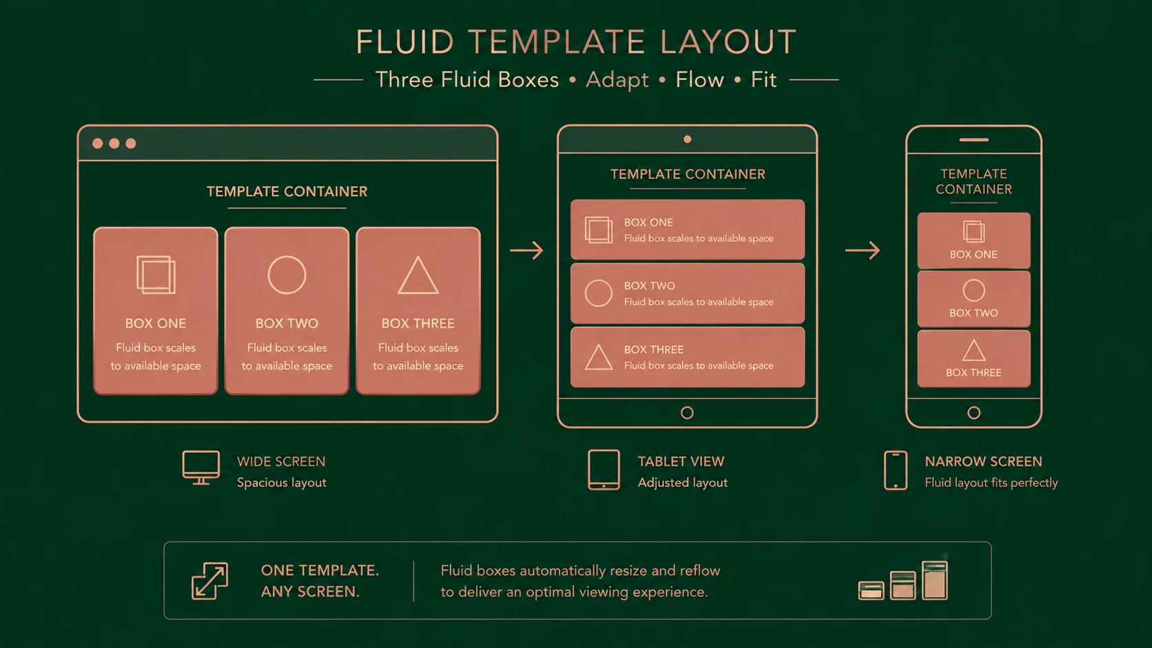
Introduction
The web development landscape has changed considerably during 2012. The rapid adoption of smartphones and tablets has fundamentally altered user expectations, forcing organizations to reconsider traditional desktop-centric website strategies. Rather than maintaining separate desktop and mobile websites, many enterprises are now embracing responsive web design as a practical solution for supporting an increasingly diverse collection of devices.
Responsive web design is no longer viewed solely as a design trend. It has become an architectural consideration affecting application development, user experience, deployment strategies, content management, and long-term maintenance. Improvements in browser support for HTML5 and CSS3, combined with growing adoption of media queries and fluid grid systems, have accelerated this transition.
For enterprise architects and development teams, 2012 marks an important milestone in the maturation of responsive design as a viable long-term web development approach.
Industry Background
The past several years have witnessed dramatic growth in connected devices. Desktop computers remain important within enterprise environments, yet smartphones and tablets are increasingly used to access corporate portals, customer-facing services, and business applications.
Historically, organizations addressed device diversity by maintaining separate websites for desktop and mobile users. Although effective in some scenarios, this approach introduces additional development effort, duplicated content, inconsistent branding, and higher maintenance costs.
Responsive web design addresses these challenges by allowing a single application to adapt dynamically according to the characteristics of the viewing device.
The Business Problem
Enterprises supporting multiple device categories commonly face several challenges:
- ◆Separate desktop and mobile codebases
- ◆Duplicate content management
- ◆Increased maintenance effort
- ◆Inconsistent user experiences
- ◆Higher development costs
- ◆Longer deployment cycles
Maintaining multiple versions of the same application often slows feature development while increasing operational complexity.
Responsive web design offers an alternative centered on adaptive layouts and standards-based technologies.
Understanding Responsive Web Design
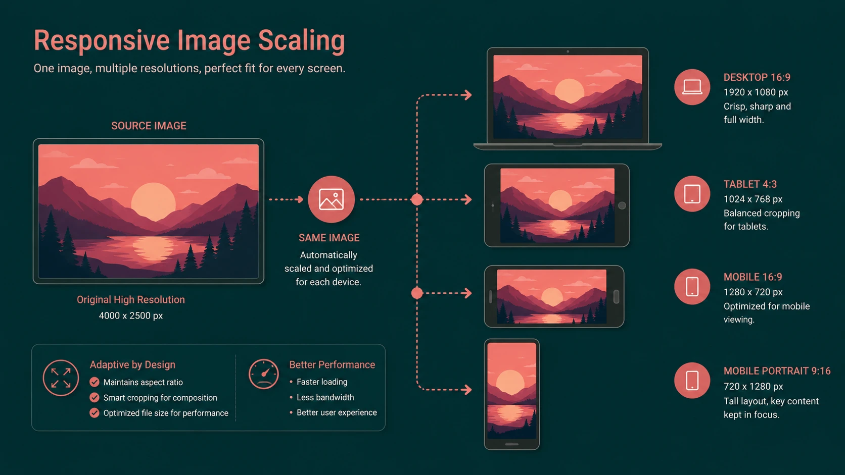
Responsive web design is a development methodology that enables web pages to adapt automatically to different screen sizes, resolutions, and orientations without requiring separate websites.
Instead of detecting specific devices, responsive applications respond to available display characteristics.
The approach typically combines:
- ◆Fluid grid layouts
- ◆Flexible images
- ◆CSS media queries
- ◆Relative sizing units
- ◆Progressive enhancement
- ◆Standards-based HTML and CSS
This methodology allows a single application to provide a consistent experience across desktops, notebooks, tablets, and smartphones.
Core Architecture
Responsive applications combine several complementary technologies.
| Component | Responsibility |
|---|---|
| HTML5 | Semantic document structure |
| CSS3 | Presentation and styling |
| Media Queries | Device-aware styling rules |
| Fluid Grid System | Flexible page layout |
| Flexible Images | Adaptive media rendering |
| JavaScript | Interactive behavior |
| Browser Rendering Engine | Dynamic layout calculation |
Together these components enable layouts to adjust automatically according to available screen space.
Key Developments During 2012
Several important developments have contributed to the growing adoption of responsive web design.
Improved Browser Support
Modern desktop and mobile browsers now provide stronger support for CSS3 and HTML5 features required by responsive layouts.
Widespread Media Query Adoption
Media queries have become one of the defining technologies enabling adaptive page layouts without maintaining separate websites.
Growth of CSS Frameworks
Front-end frameworks increasingly provide responsive grid systems that simplify application development.
Mobile Browser Improvements
Newer smartphone and tablet browsers demonstrate improved standards compliance, reducing platform-specific development effort.
Better Development Tools
Modern browser developer tools now make responsive testing significantly easier during application development.
How Responsive Design Works
A responsive application generally follows this workflow:
- 1.Browser loads HTML content.
- 2.CSS stylesheets are applied.
- 3.Media queries evaluate screen characteristics.
- 4.Appropriate layout rules become active.
- 5.Images and content scale dynamically.
- 6.Navigation adjusts for available screen space.
- 7.User receives an interface optimized for the current device.
Unlike traditional mobile websites, the underlying application remains the same while presentation adapts automatically.
Enterprise Use Cases
Responsive web design offers advantages across numerous enterprise scenarios.
Corporate Websites
Organizations can maintain consistent branding while supporting multiple device categories.
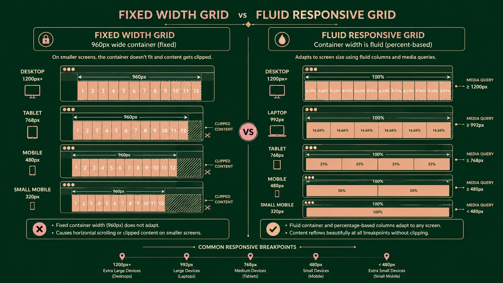
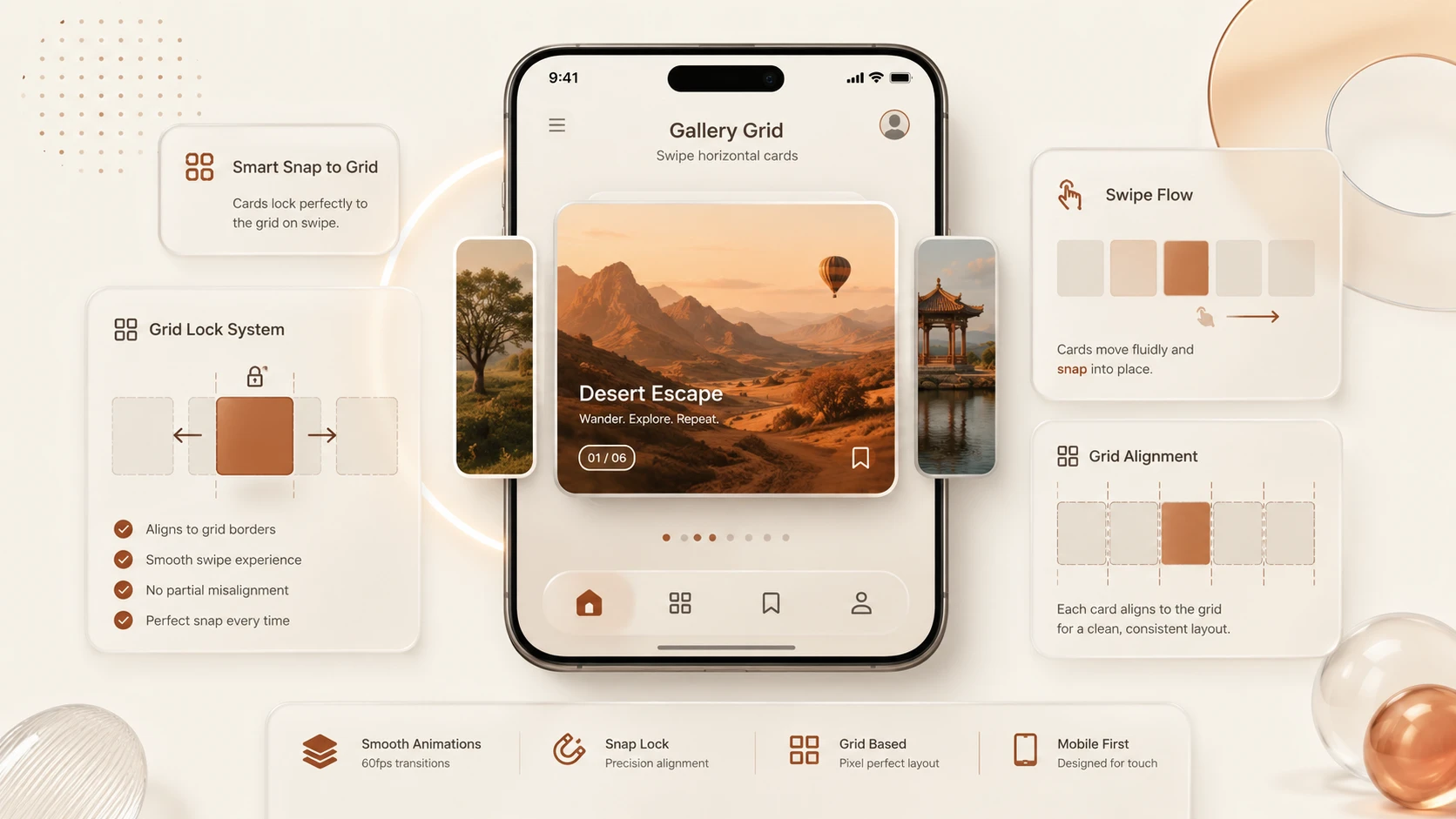
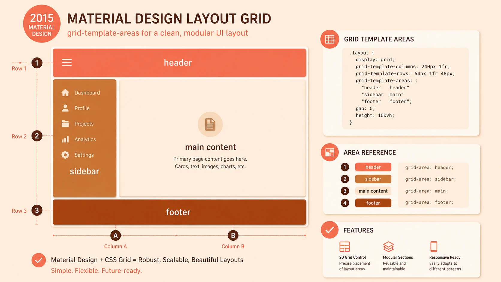
System architecture diagram and conceptual workflow layout for The Responsive Web.
Customer Self-Service Portals
Clients gain access to services regardless of whether they use desktops, tablets, or smartphones.
Employee Portals
Internal business systems become accessible from a wider variety of enterprise-managed devices.
E-Commerce Platforms
Retail websites benefit from consistent shopping experiences across different screen sizes.
Software as a Service
Cloud applications reduce maintenance overhead by supporting multiple devices through a unified interface.
Performance Considerations
Although responsive design simplifies application maintenance, performance remains an important architectural consideration.
Organizations should focus on:
- ◆Optimizing image delivery
- ◆Minimizing CSS complexity
- ◆Reducing JavaScript payloads
- ◆Combining static resources
- ◆Browser caching
- ◆Efficient page rendering
A responsive application should not simply deliver desktop-sized resources to mobile devices. Performance optimization remains essential.
Security Considerations
Responsive design primarily affects presentation rather than application security.
Nevertheless, organizations should continue implementing:
- ◆Secure authentication
- ◆HTTPS communication
- ◆Session management
- ◆Input validation
- ◆Authorization controls
- ◆Secure API integration
Device independence should not alter established enterprise security practices.
Scalability
Responsive design contributes to scalability primarily through simplified application maintenance.
Benefits include:
- ◆Single application architecture
- ◆Unified deployment process
- ◆Shared business logic
- ◆Consistent user experience
- ◆Reduced development duplication
- ◆Easier feature expansion
Supporting multiple devices through one application enables organizations to allocate development resources more efficiently.
Best Practices
Organizations implementing responsive web applications should consider the following recommendations.
- ◆Design mobile-friendly layouts from the beginning.
- ◆Use fluid rather than fixed-width layouts.
- ◆Optimize images for multiple display sizes.
- ◆Test across numerous browsers and devices.
- ◆Keep navigation simple.
- ◆Prioritize performance optimization.
- ◆Follow semantic HTML practices.
- ◆Separate presentation from business logic.
Common Mistakes
| Mistake | Enterprise Impact |
|---|---|
| Designing only for desktop | Poor mobile experience |
| Excessive fixed-width layouts | Limited adaptability |
| Oversized images | Slow loading |
| Ignoring browser testing | Inconsistent rendering |
| Overusing JavaScript | Reduced performance |
| Treating responsive design as only visual styling | Weak architecture |
Successful responsive applications require collaboration between designers, developers, and architects.
Technology Comparison
| Capability | Separate Mobile Website | Responsive Web Design |
|---|---|---|
| Codebase | Multiple | Single |
| Content Management | Duplicated | Unified |
| Maintenance | Higher | Lower |
| Device Support | Platform Specific | Adaptive |
| Deployment | Multiple Applications | Single Application |
| Long-Term Scalability | Limited | Improved |
Although responsive development introduces additional front-end complexity, its operational advantages become increasingly valuable as device diversity grows.
Adoption Strategy
Organizations planning responsive initiatives should approach implementation strategically.
Recommended steps include:
- 1.Audit existing web applications.
- 2.Identify mobile usage patterns.
- 3.Modernize HTML and CSS structure.
- 4.Introduce responsive layouts incrementally.
- 5.Optimize client-side performance.
- 6.Perform cross-browser testing.
- 7.Validate accessibility requirements.
- 8.Deploy gradually while monitoring user feedback.
A phased migration reduces implementation risk while preserving business continuity.
Limitations
Despite significant progress during 2012, responsive web design continues to present several challenges.
- ◆Legacy browsers may provide inconsistent CSS3 support.
- ◆Complex layouts require additional testing.
- ◆Large images remain a performance concern.
- ◆Device capabilities continue evolving rapidly.
- ◆Some applications may still require device-specific functionality.
Organizations should therefore evaluate responsive design alongside broader application architecture and performance strategies.
Looking Ahead
From the perspective of December 2012, responsive web design has progressed from an emerging concept into one of the defining architectural trends in modern web development. Improvements in browser standards support, mobile hardware, CSS capabilities, and front-end development practices have demonstrated that a unified application can successfully serve a wide variety of devices without maintaining separate codebases.
As organizations continue investing in HTML5, CSS3, and standards-based web technologies, responsive design is expected to become an increasingly common foundation for enterprise web applications. While implementation practices will continue evolving, the principles established during 2012 provide a strong architectural framework for building maintainable, scalable, and device-independent web experiences.