Introduction
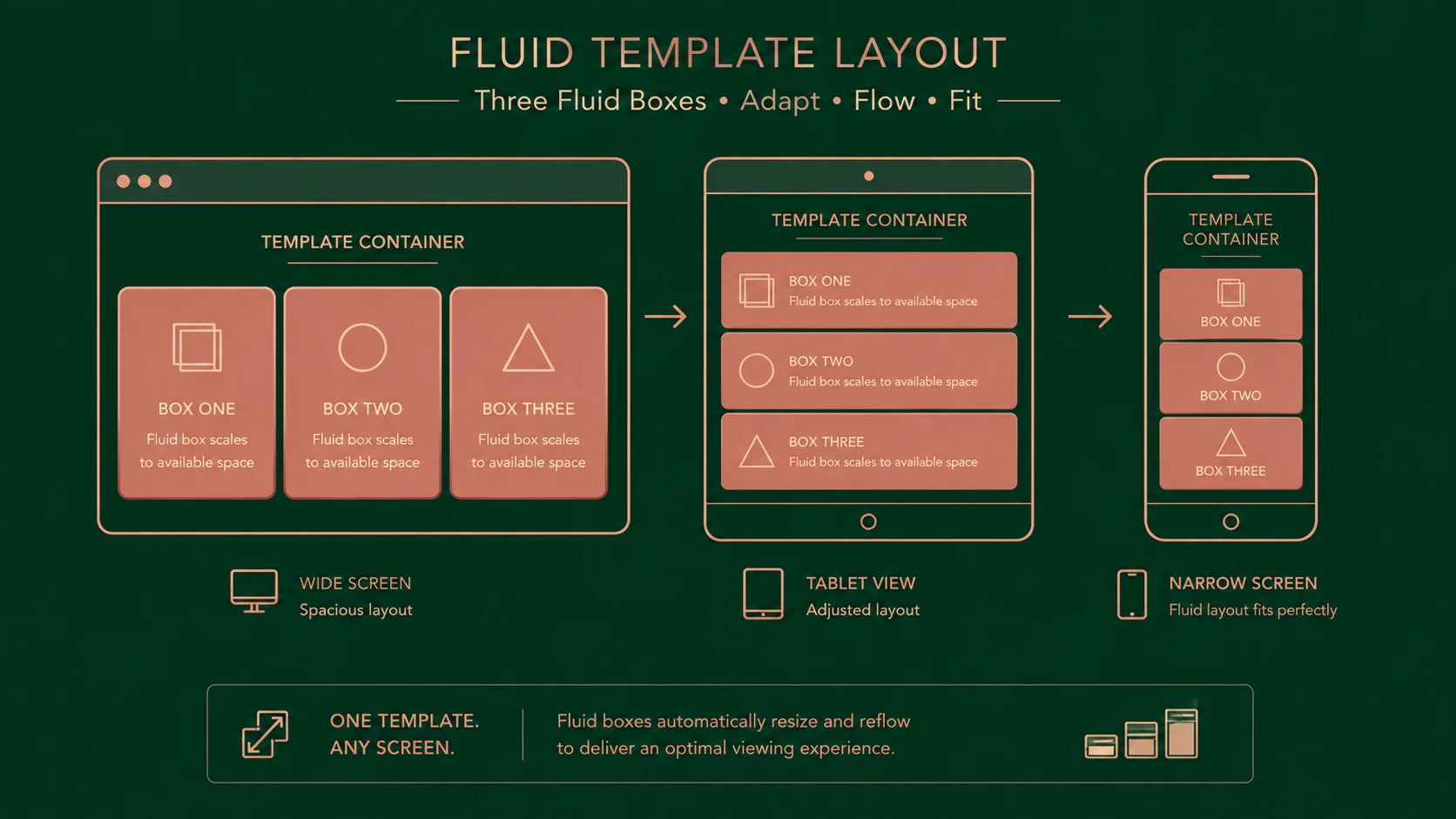
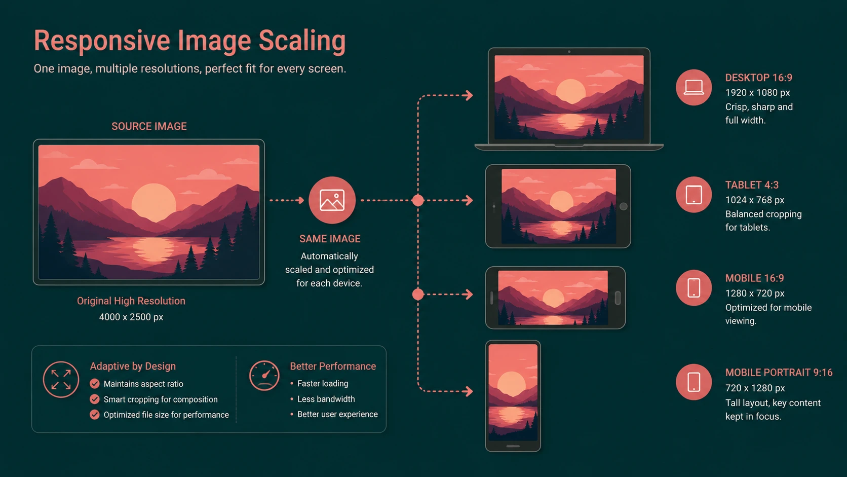
Responsive Web Design has successfully addressed many layout challenges through flexible grids, fluid typography, and CSS media queries. However, images remain one of the largest obstacles to delivering efficient multi-device experiences. While page layouts can adapt to varying viewport sizes, image assets often remain fixed, forcing browsers to download unnecessarily large files or display images that are not optimized for the current device.
The web community is actively exploring solutions including the proposed HTML picture element and the srcset attribute, both intended to improve image selection based on viewport size and device characteristics.
From the perspective of September 2013, responsive image technologies are still evolving, but they represent an important step toward more efficient web performance and improved user experience.
Industry Background
The diversity of connected devices has increased dramatically.
Enterprise applications are expected to support:
- ◆Smartphones.
- ◆Tablets.
- ◆Desktop computers.
- ◆High-resolution displays.
- ◆Multiple browser engines.
- ◆Varying network conditions.
Responsive layouts successfully reorganize page content using CSS media queries, but images frequently account for the largest portion of page downloads.
Many organizations currently serve identical image assets regardless of screen size, resulting in unnecessary bandwidth consumption and slower page rendering on smaller devices.
The Business Problem
Traditional image delivery introduces several challenges.
Organizations commonly experience:
- ◆Excessive bandwidth usage.
- ◆Slow mobile page loads.
- ◆Poor user experience.
- ◆Increased hosting costs.
- ◆Limited image flexibility.
- ◆Difficult maintenance of multiple image versions.
As mobile browsing continues growing, delivering appropriately sized images becomes an important performance optimization rather than simply a design enhancement.
Understanding the Technology
Responsive image proposals seek to allow browsers to select the most appropriate image resource based on device capabilities and layout requirements.
Emerging approaches include:
- ◆Fluid image scaling.
- ◆CSS media queries.
- ◆The proposed picture element.
- ◆The proposed srcset attribute.
- ◆Multiple image resolutions.
- ◆Device-aware resource selection.
Rather than relying solely on CSS resizing, browsers may eventually choose image resources more intelligently before downloading them.
Core Architecture
A simplified responsive image workflow appears below.
| Component | Responsibility |
|---|---|
| HTML Document | References image resources |
| Responsive Image Markup | Defines available image options |
| Browser | Evaluates viewport and capabilities |
| Image Resources | Multiple image sizes or formats |
| Rendering Engine | Displays selected image |
This architecture aims to reduce unnecessary downloads while preserving visual quality.
Key Features
Fluid Images
Images scale proportionally within flexible layouts using CSS techniques.
Proposed picture Element
The picture proposal allows developers to define multiple image resources intended for different rendering scenarios.
Proposed srcset Attribute
The srcset proposal enables browsers to select from multiple image candidates without requiring complex scripting.
Device Adaptation
Image selection may eventually consider viewport dimensions and display characteristics before downloading resources.
Progressive Enhancement
Applications can continue functioning in browsers lacking support while adopting newer capabilities where available.
Responsive Integration
Responsive image techniques complement existing responsive layout methodologies.
How It Works
A simplified image selection workflow appears below.
Browser Requests Page
        |
Responsive Image Markup
        |
Viewport Evaluation
        |
Available Image Candidates
        |
Browser Selects Resource
        |
Optimized Image Display
The objective is to transfer only the image resource appropriate for the current viewing environment.
Enterprise Use Cases
Responsive image strategies benefit numerous enterprise applications.
Corporate Websites
Marketing sites can reduce download sizes while maintaining high-quality branding imagery.
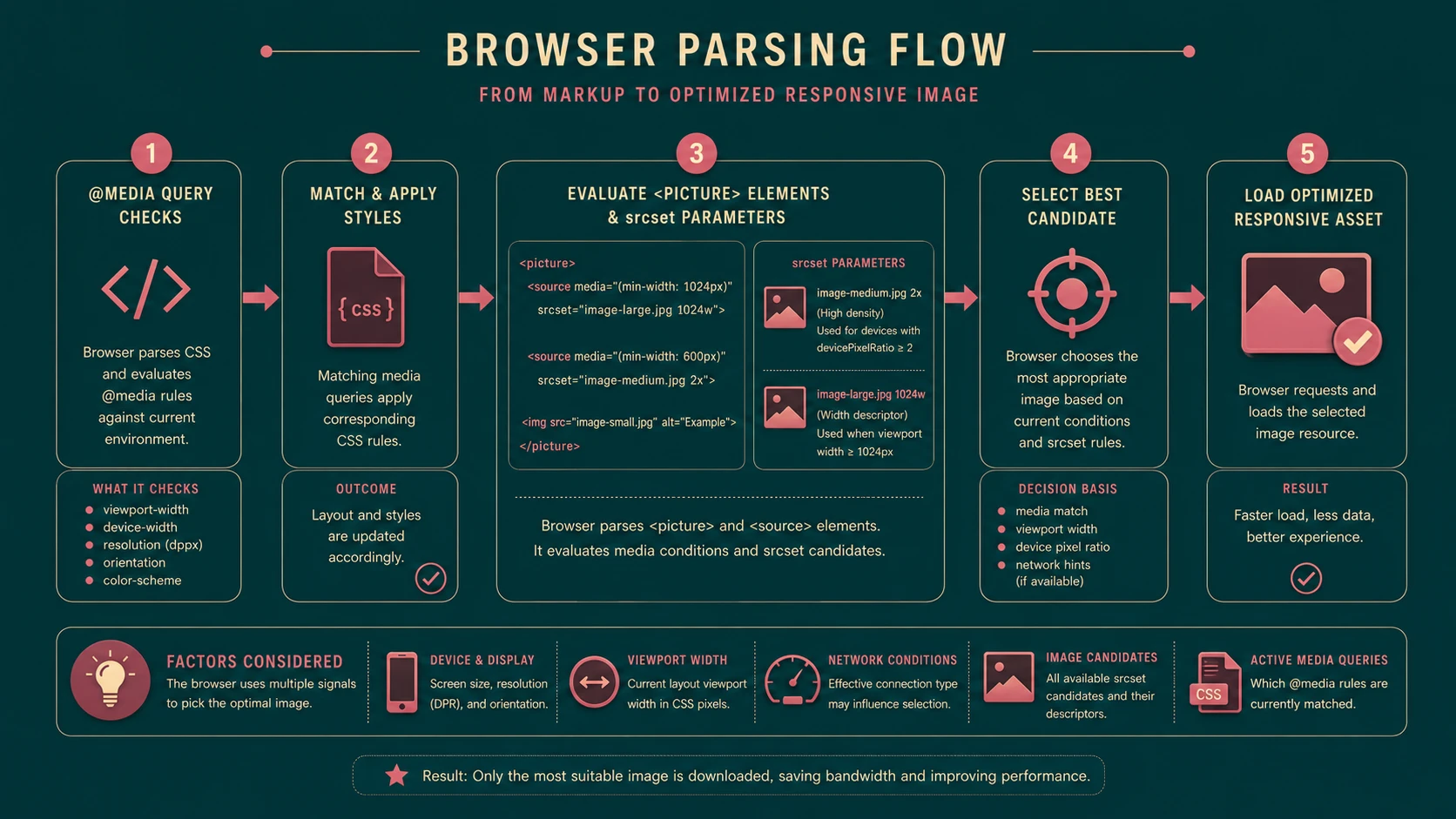
System architecture diagram and conceptual workflow layout for Responsive Images.
E-Commerce Platforms
Product photography can be optimized for mobile devices without sacrificing desktop presentation.
News Portals
Content-heavy websites benefit from improved page performance across multiple devices.
Enterprise Dashboards
Business applications containing charts and visual reports can adapt more efficiently to varying screen sizes.
Media Publishing
Publishers serving image-rich content can improve bandwidth utilization and page responsiveness.
Performance Considerations
Responsive image optimization directly affects application performance.
Important considerations include:
- ◆Image compression.
- ◆Appropriate image dimensions.
- ◆Network latency.
- ◆Browser caching.
- ◆Asset management.
Serving smaller image resources to mobile devices can significantly reduce page weight and improve loading performance.
Security Considerations
Responsive image technologies introduce few direct security concerns, but organizations should continue following secure deployment practices.
Recommended considerations include:
- ◆Secure content delivery.
- ◆HTTPS image distribution.
- ◆Access control for protected resources.
- ◆Validation of uploaded media.
- ◆Controlled asset management.
Image optimization should be integrated into existing application security practices rather than treated separately.
Scalability
Managing multiple image variants requires scalable asset management strategies.
Organizations should consider:
- ◆Centralized media repositories.
- ◆Automated image generation.
- ◆Content Delivery Networks.
- ◆Consistent naming conventions.
- ◆Build process integration.
These practices simplify long-term maintenance while improving delivery efficiency.
Best Practices
Development teams should:
- ◆Design responsive layouts before optimizing images.
- ◆Compress image assets appropriately.
- ◆Generate multiple image sizes where practical.
- ◆Test across representative devices.
- ◆Monitor page performance regularly.
- ◆Avoid serving unnecessarily large images.
- ◆Integrate responsive image workflows into build processes.
These recommendations improve both user experience and infrastructure efficiency.
Common Mistakes
| Mistake | Business Impact |
|---|---|
| Serving desktop images to mobile devices | Increased bandwidth usage |
| Ignoring compression | Slower page loads |
| Depending solely on CSS resizing | Unnecessary downloads |
| Poor asset organization | Difficult maintenance |
| Limited device testing | Inconsistent rendering |
| Missing caching strategy | Increased server load |
Avoiding these issues enables organizations to build more efficient responsive websites.
Technology Comparison
| Technique | Advantages | Considerations |
|---|---|---|
| CSS Fluid Images | Simple implementation | Downloads same image regardless of device |
| CSS Media Queries | Responsive layouts | Does not select image resources |
| Proposed srcset | Browser-controlled image selection | Browser support continues to evolve |
| Proposed picture Element | Flexible resource selection | Standardization and implementation are still developing |
The emerging HTML proposals seek to complement rather than replace existing responsive design techniques.
Adoption Strategy
Organizations should adopt responsive image strategies incrementally.
Recommended roadmap:
- 1.Optimize existing image assets.
- 2.Implement fluid image layouts.
- 3.Evaluate emerging responsive image proposals.
- 4.Monitor browser support.
- 5.Introduce automated image generation workflows.
- 6.Continuously measure page performance.
A gradual adoption strategy minimizes compatibility risks while improving application efficiency.
Limitations
From the perspective of September 2013, responsive image standards are still evolving.
Organizations should recognize several considerations.
- ◆Browser support is not yet consistent.
- ◆Standards discussions continue within the web community.
- ◆Existing workflows may require modification.
- ◆Managing multiple image assets increases operational complexity.
- ◆Tooling ecosystems continue to mature.
These limitations should be balanced against the growing importance of mobile performance.
Looking Ahead
From the perspective of September 2013, responsive images represent one of the final major challenges in fully responsive web design. While fluid layouts and media queries have significantly improved multi-device compatibility, efficient image delivery remains an area of active innovation.
The proposed picture element and srcset attribute offer promising approaches that could allow browsers to make more intelligent image selection decisions while reducing bandwidth consumption and improving page performance. As browser vendors continue evaluating these proposals, enterprise development teams should monitor standards progress closely and prepare their front-end architectures to take advantage of responsive image capabilities as they mature.